System icons
Approach
Icons can help users make sense of the interface. Only use an icon when it helps support a user’s understanding or to draw attention to key information.
Use icons to represent:
Actions for the user, such as making a search query.
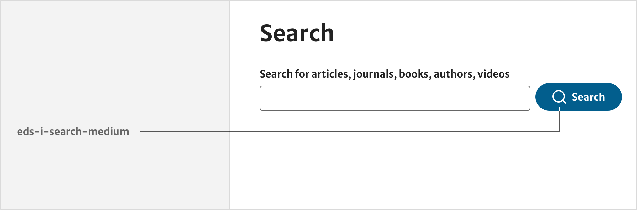
Status messages, such as an information update to a service.
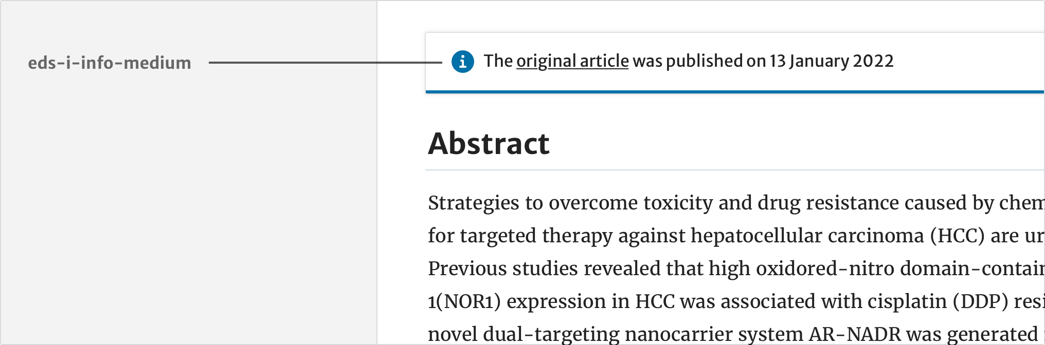
Meta data, such as a list of publishing metrics.
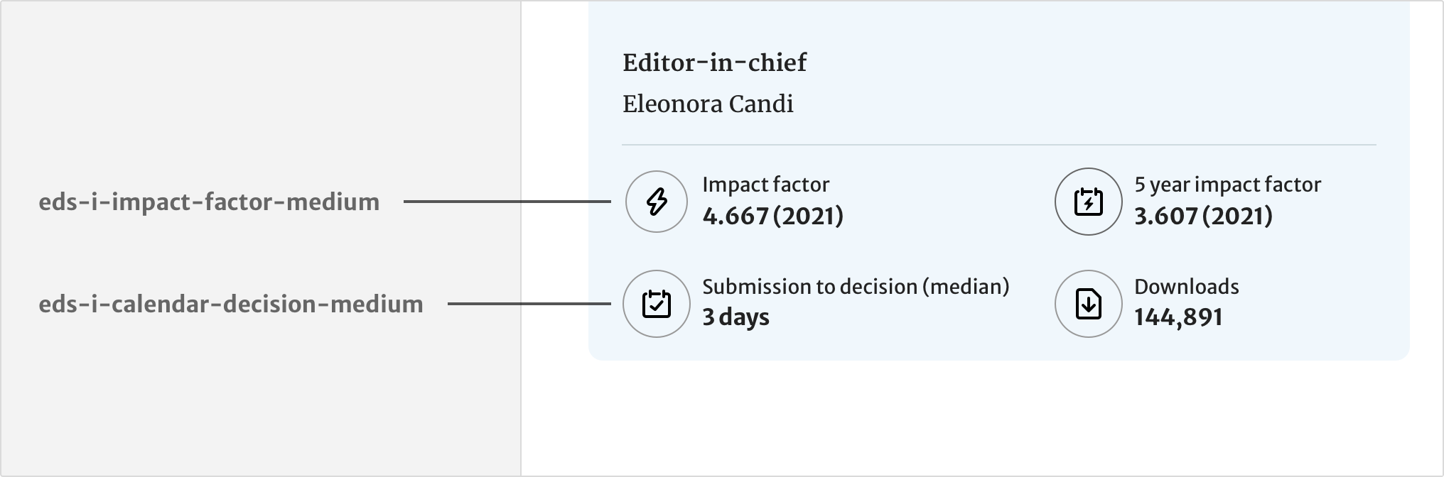
Signposting, such as additional services.
Implementation
Elements provides icons in SVG format. You can find these under img/icons in the Springer Nature and Nature themes.
Icons are referenced by file path followed by id.
This reference is used in components with the SVG <use> element. For example, the breadcrumbs component includes a chevron icon:
<svg class="c-breadcrumbs__chevron" width="12" height="12" aria-hidden="true" focusable="false">
  	<use xlink:href="path/to/icons/chevron-right.svg#i-chevron-right"></use>
</svg>
Replace the path in the previous example with the variable from the consumer view model:
chevronURL:
'path/to/icons/chevron-right.svg#i-chevron-right'
Icon library
System icons are designed specifically for interfaces and optimised for use on the web. Icons are assigned to common use cases.
For corporate communication, such as presentations or internal documents, use the brand icon library instead.
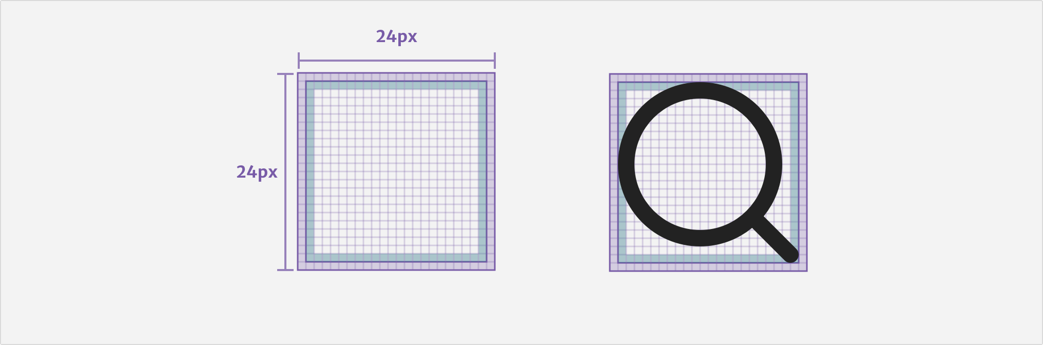
Anatomy
All system icons are built by default on a 24 x 24 pixel grid. Selected icons can also be built for additional sizes, using a 32 x 32 or 16 x 16 pixel grid. Icons are drawn for pixel precision and to be legible at small sizes for a variety of screens.
New icons
Requests for new icons must be made to the UI Design team. UI Designers will review the request before building the icon and adding to the system set.
Make sure you get feedback on the design from UI and UX designers who are working on products that will be using the finished icon. During the review stage, ask for feedback on:
- can people understand its intended meaning
- is it recognisable across different screen sizes and resolutions
- does it look and feel consistent with the rest of the system set
Applying icons
When creating interfaces, only use system icons provided by Elements. Each icon is assigned to represent a concept or idea.
System icons are provided in three standard sizes:
- medium (24px) is the default size for all icons in the system set
- large (32px) is for select icons used for signposting
- small (16px) is for select icons used in some components, such as breadcrumbs
When placing icons next to text, use the spacing token margin-200 (8px).
Be consistent
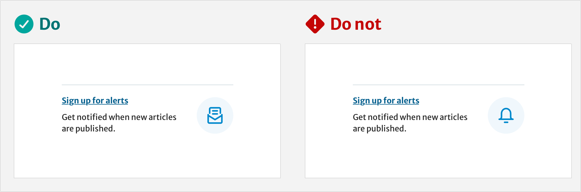
Use icons consistently when representing concepts. For example, journal alerts and newsletters should use the newsletter icon. Do not use different icons for similar concepts.
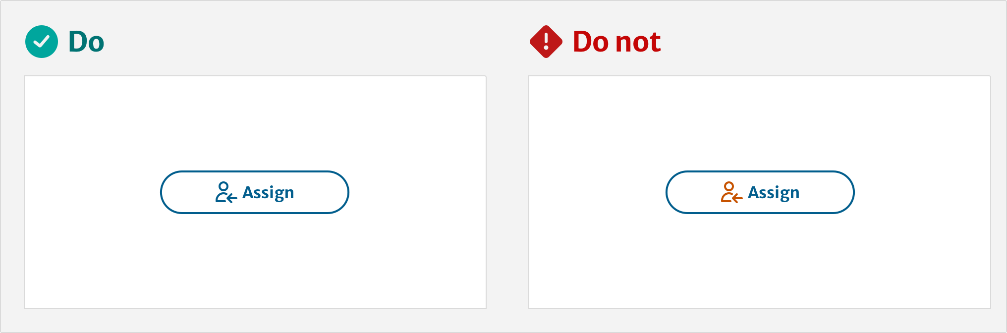
Use a text label
Use a text label to prevent ambiguity. If there is no text label associated with the icon, add alternative text to describe the icon’s meaning.
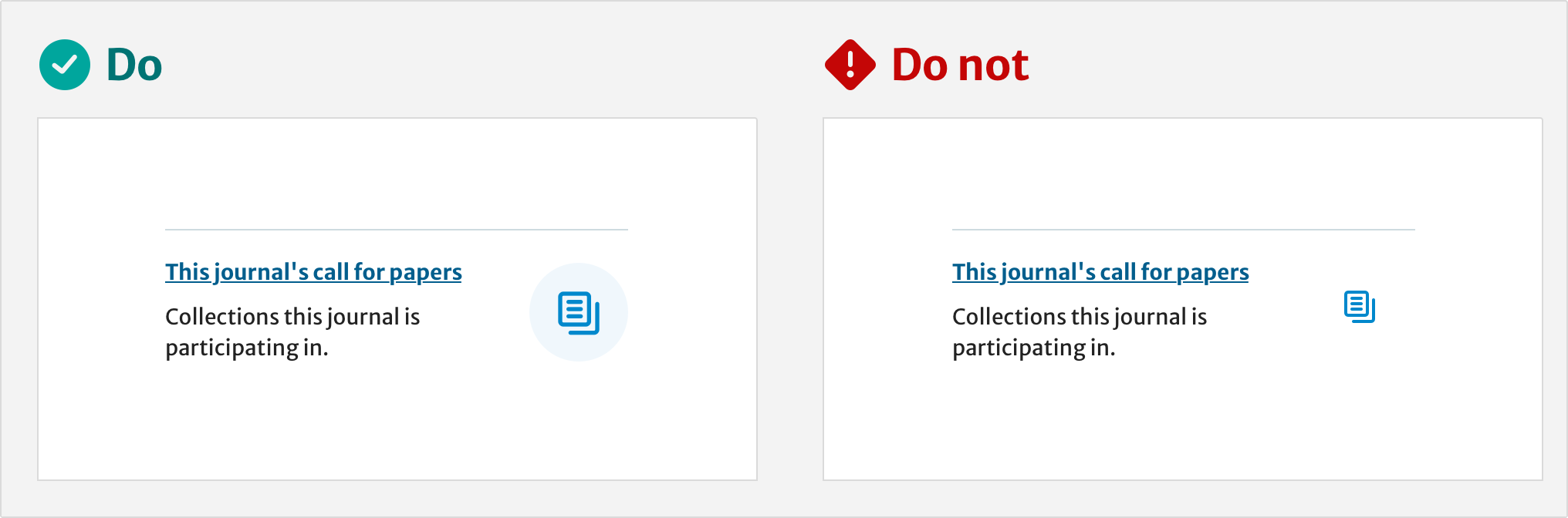
Colour usage
Icons SVG’s naturally inherit the colour of the text they are paired with. Do not customise the icon colour, unless the icon is representing a status.
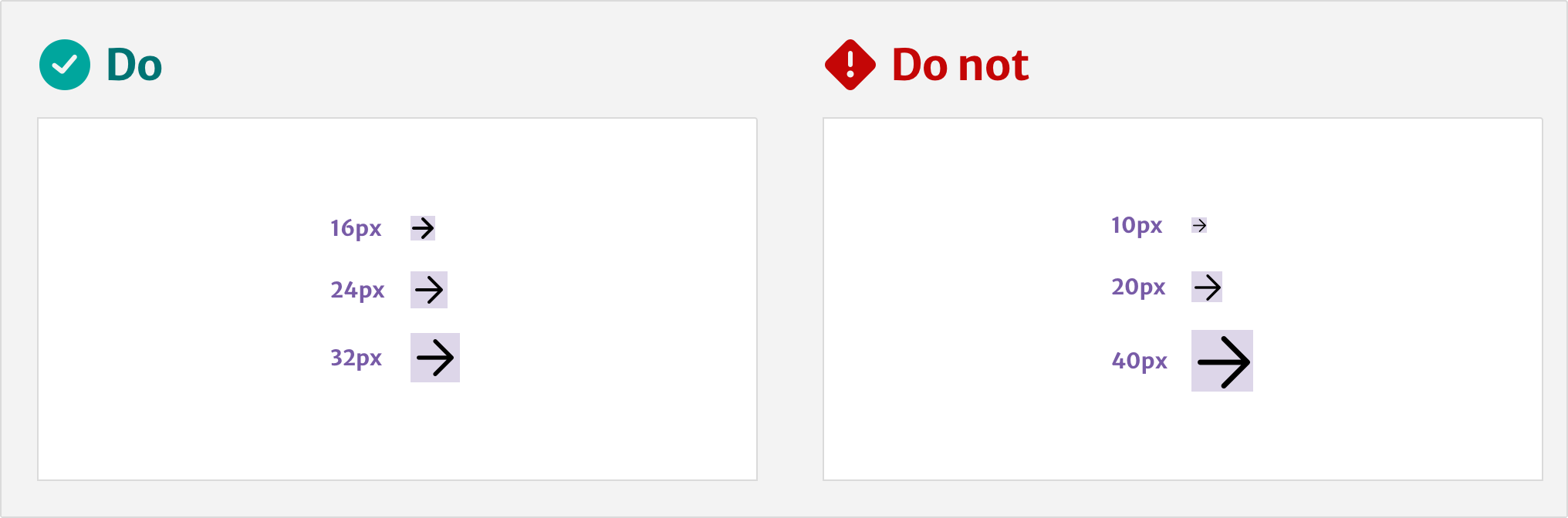
Size
Use the standard sizes available for each icon. For example, eds-i-arrow-right-medium. Do not resize an icon to a different size, or to a non-standard size.
Signposting
Icons can be used to signpost relevant products or services. For text links, use the large size icon (if available) positioned on a 64px oval shape, using the blue-200 colour.
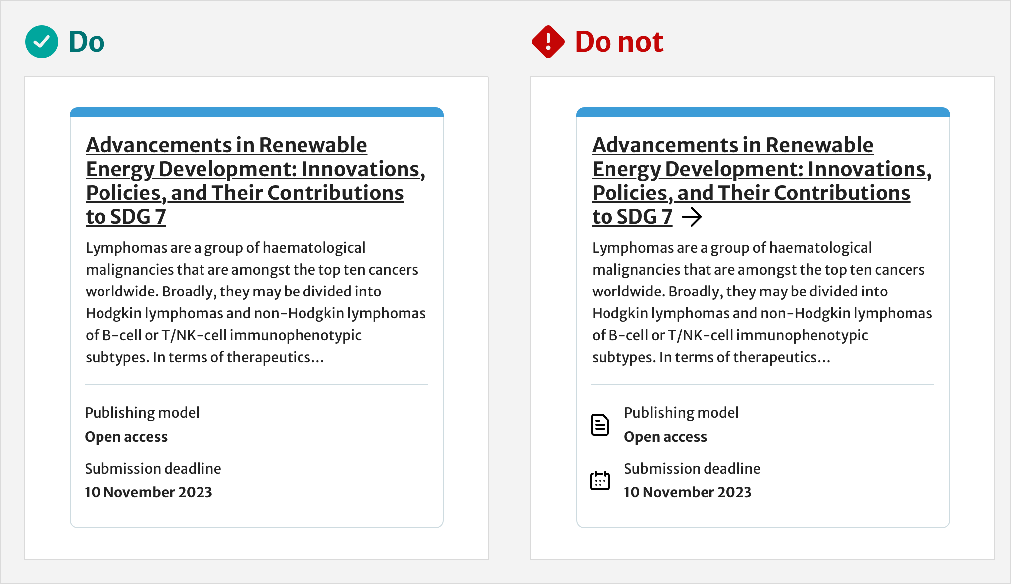
Use fewer icons
Using icons for every element can clutter the interface, making information hard to find. For example, do not use icons for each piece of information in a list as this can become repetitive.
Help improve this page
If you have a question, idea, or suggestion to improve this component or guidance, post in the #ask-elements Slack channel or the #ask-elements Teams channel.