Layout
Approach
Content first
Before you think about layout, think about the content. Understand what tasks users are doing and what information they need when they come to your page. Then consider how the layout of content and actions on the page reflect their importance for the user.
Responsive design
Layouts must adapt to a range of different viewport or screen sizes. Think about the content and tasks you need to display and how to structure it in a single column first.
Create structure
Give your content appropriate structure. Using headings, short paragraphs and bulleted lists helps users to find and take in the information they need. Go to our guidelines on page titles and headings.
Layout basics
Every page must include the header and footer components. This allows common interactions to persist between products.
The content area is where the page information and tasks are organised.
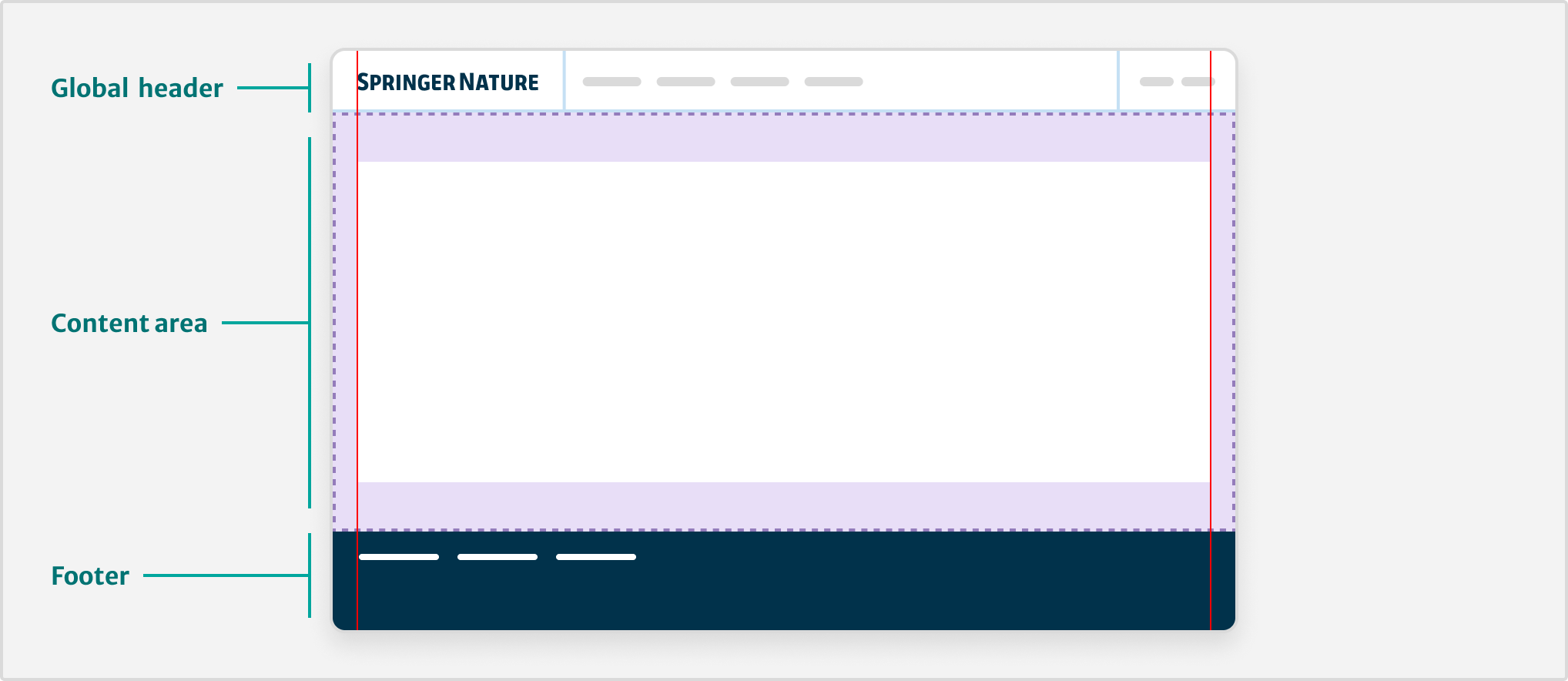
The <u-container> utility wraps everything inside the content area to create a max-width of 1280px. This centres the content on the viewport with 16px padding on either side.
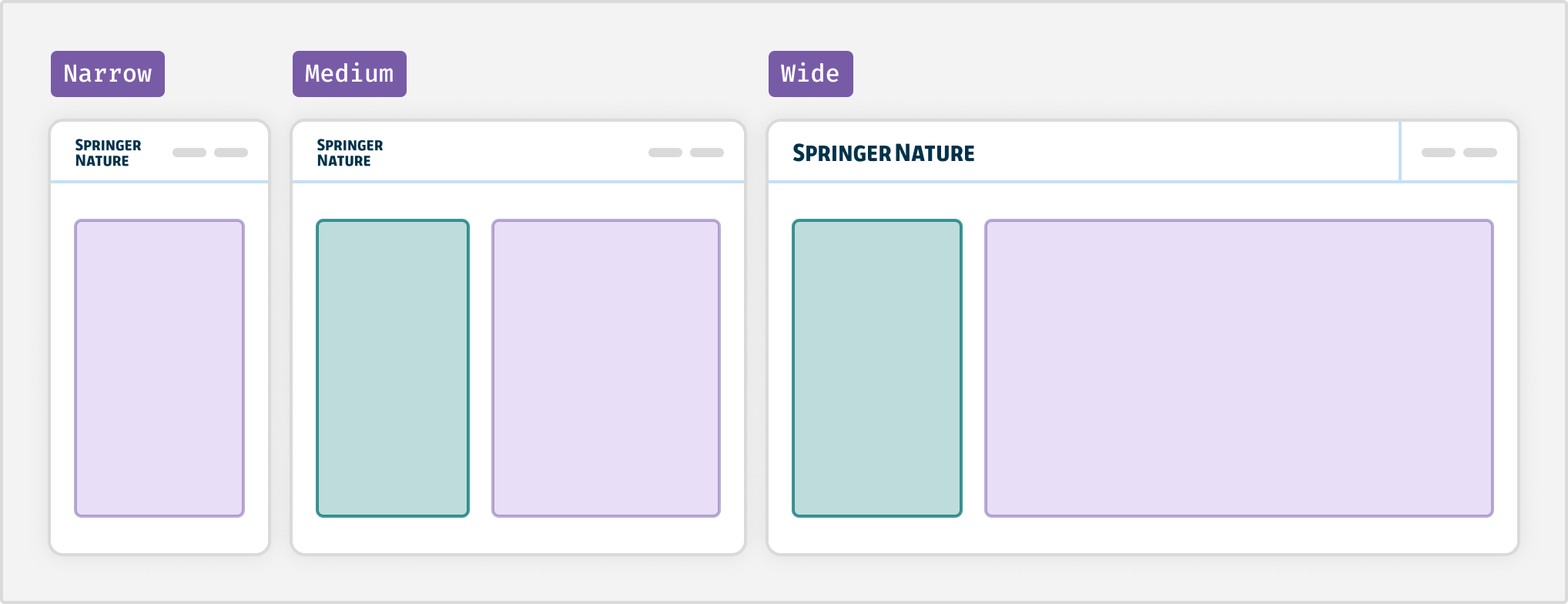
Responsive design
Take a fluid approach so that content can adapt to any viewport size. This means being less reliant on breakpoints or fixed columns.
Where multiple columns can fit in the available space, a grid emerges. Where they cannot, a simple single column layout takes its place.
| Breakpoint | Size |
|---|---|
| xs | 480px |
| sm | 768px |
| md | 876px |
| lg | 1024px |
| xl | 1220px |
Spatial organisation
Elements that are near to each other tend to be seen as a group. To understand more about the visual space and boundaries between elements, go to our spacing guidelines.
Readable body text
Use a maximum line length of 60 to 75 characters for body text. This will help to stop text becoming difficult to read on a wide viewport.
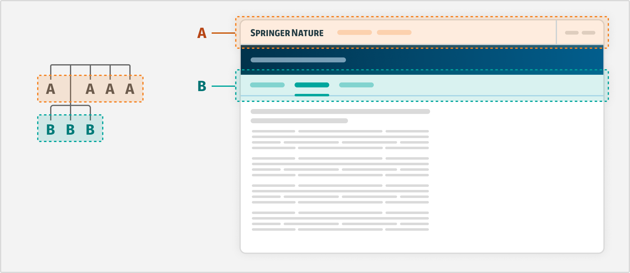
Navigating between pages
The header component helps users navigate across different products and services and is always present.
Within a particular product area, you can use the navigation component to provide a secondary level of navigation. Create groups of pages that will help users of the specific product or service.
Standard layouts
Good layouts will help guide the user's attention to things they want to do or need to know.
Use our standard layouts as a starting point to organise the page content and components for common use cases.
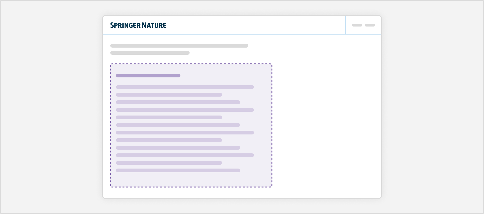
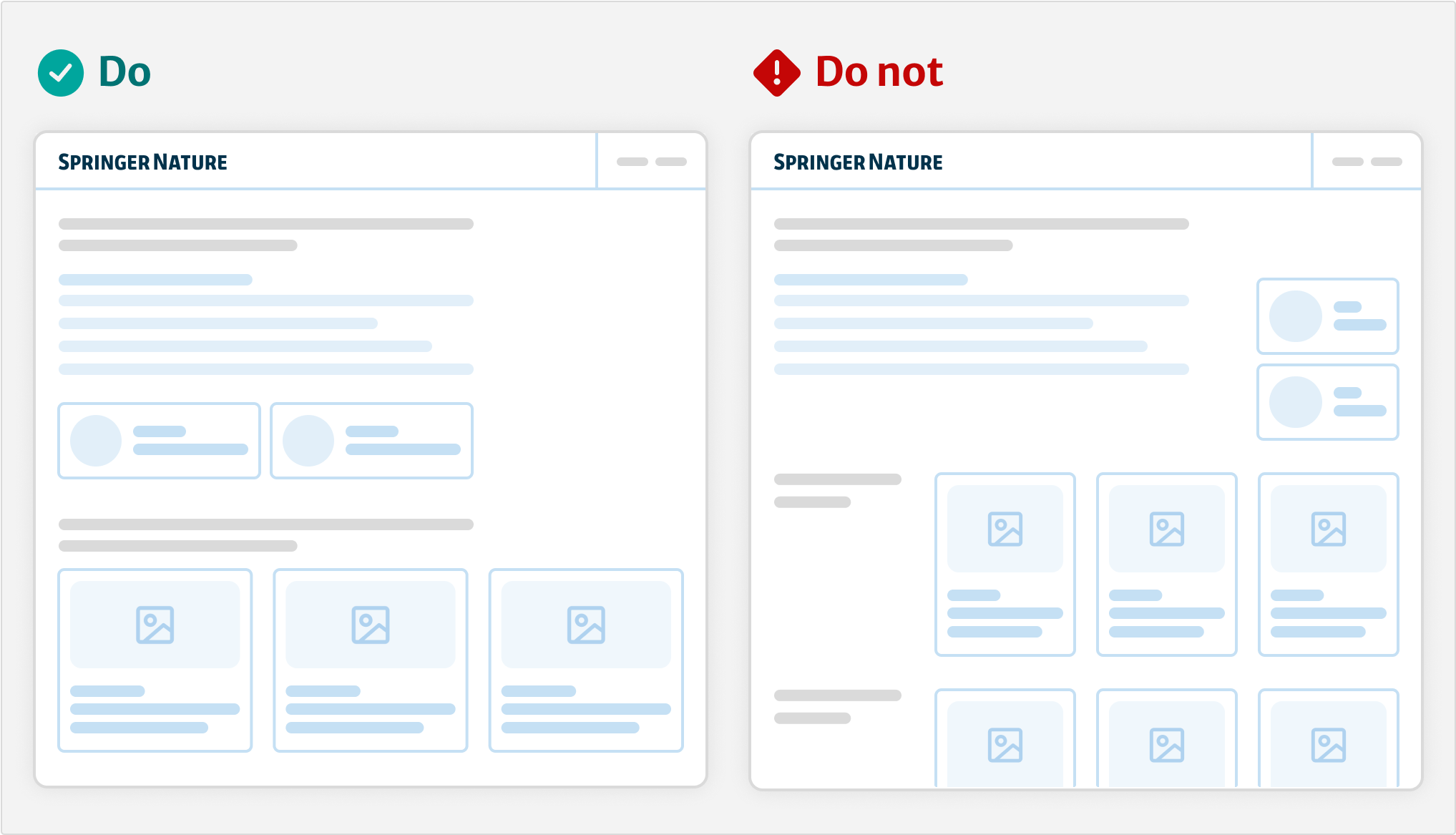
Single column
Start with a single column layout first. This helps users focus on one task at a time, for example filling in a form, or reading.
We restrict this column to two thirds of the content area on a wide viewport so that users can scan quicker.
Use <u-layout-focus> to apply a two thirds column to an element.
Some elements may need the full width of the content area, such as tables and data visualisations.
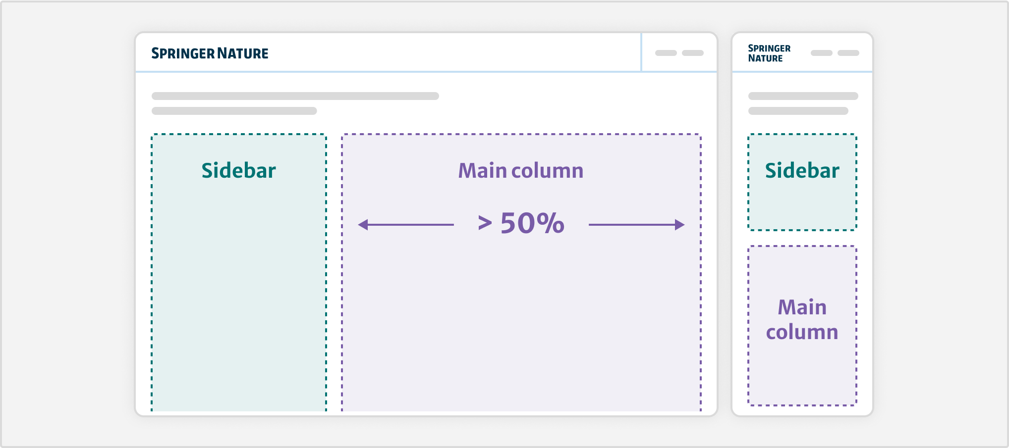
Column with sidebar
This layout has 2 columns. The “sidebar” column is smaller and sits on one side of the main column, which takes up two thirds of the horizontal space on a wide viewport.
On smaller viewports, they stack on-top of each other. The left column will always stack above the right-hand column.
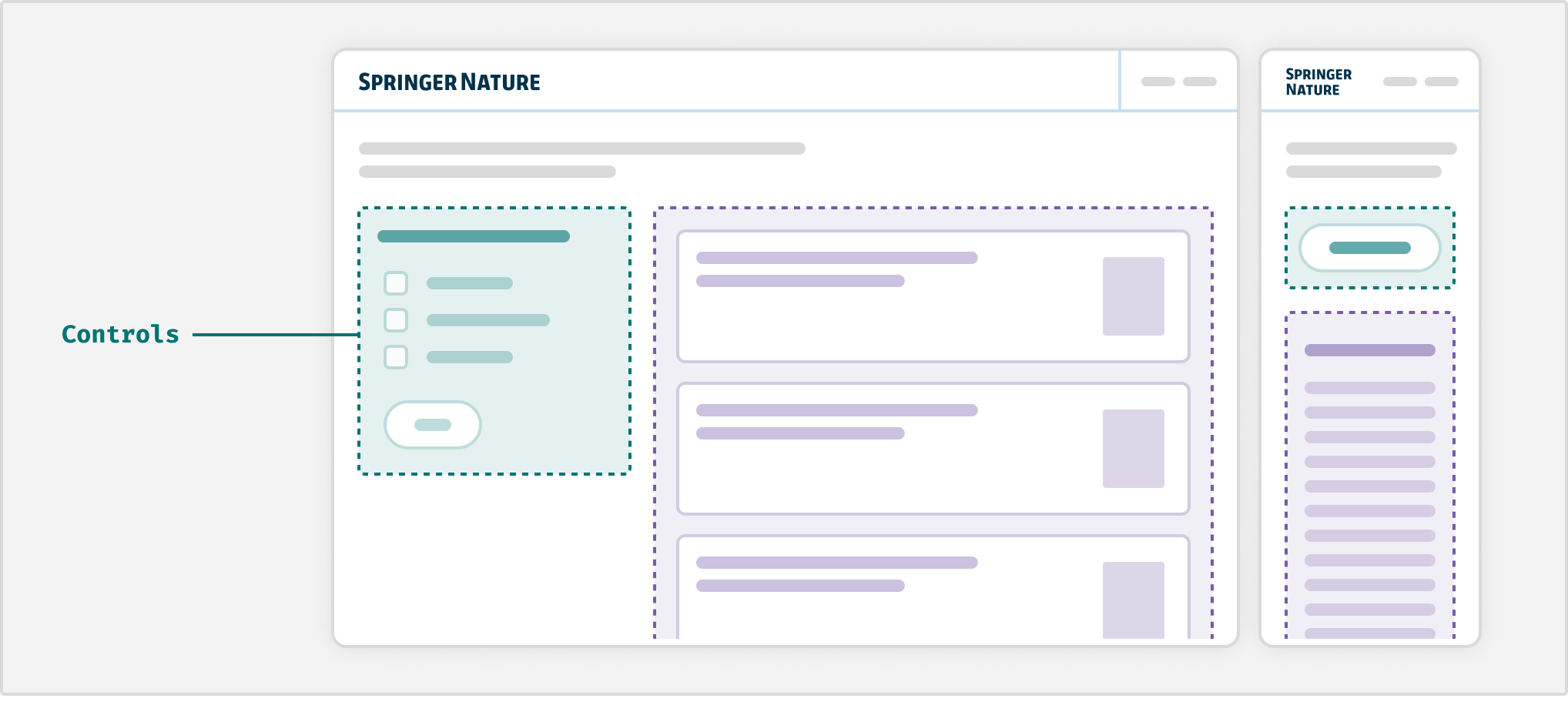
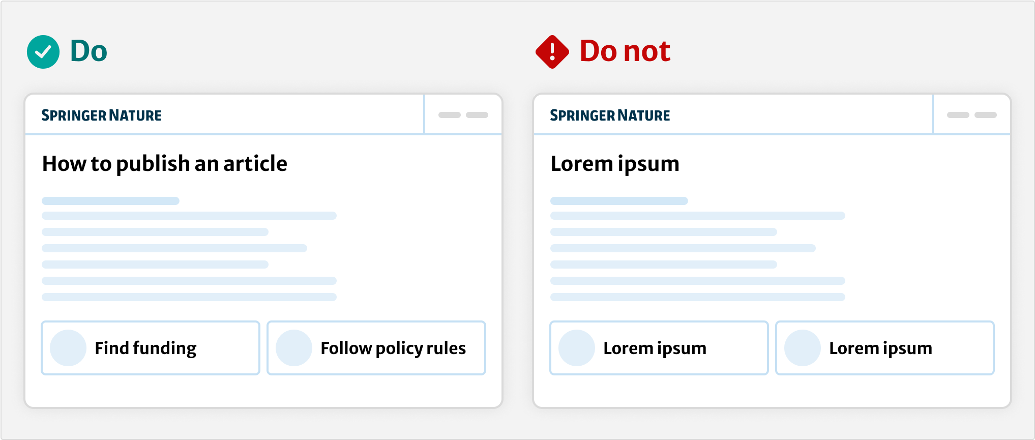
Use the layout with sidebar component to create this layout. Consider this when you need to show the main content alongside supporting functionality. This includes:
Filters and controls (left side)
Sometimes users will need to filter a large set of options, such as search results. Use the accordion component to organise long groups of filters. On small viewports, use a button to show the filters on a separate full-screen panel.
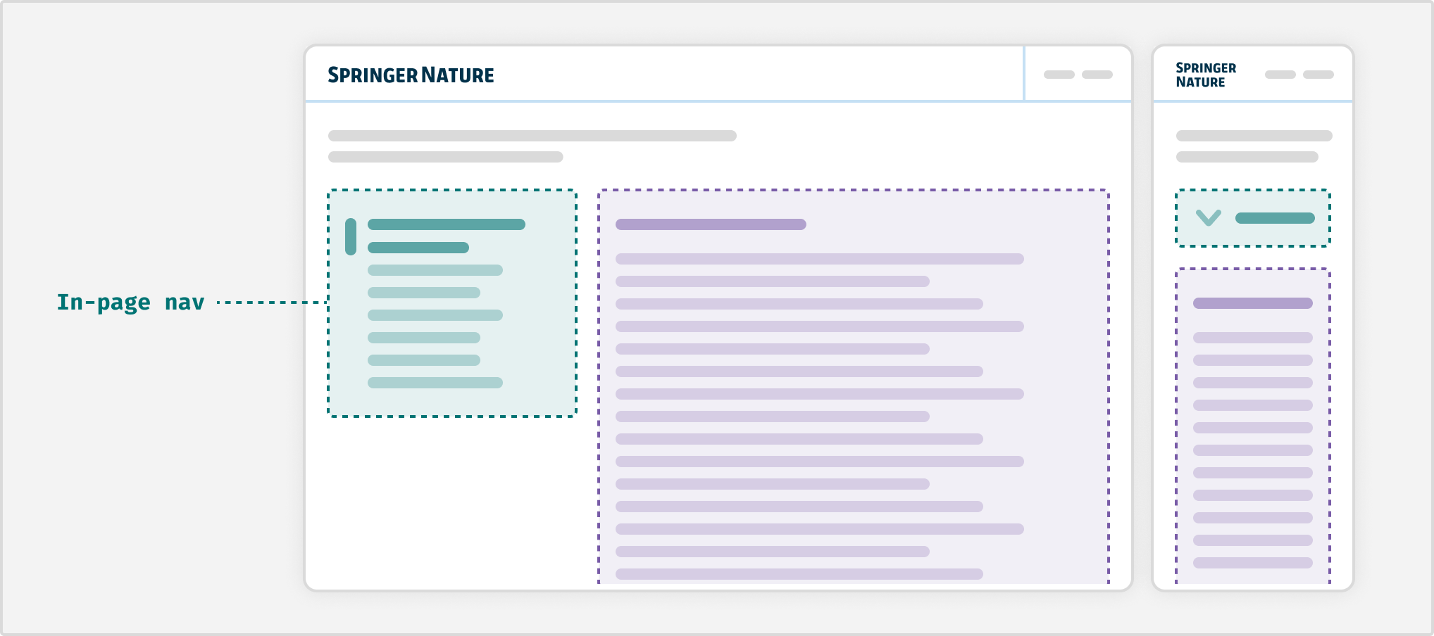
In-page navigation (side bar, left side)
For longform content, such as research articles, position anchor links in the in-page navigation. On small viewports, use the details component to collapse the in-page navigation.
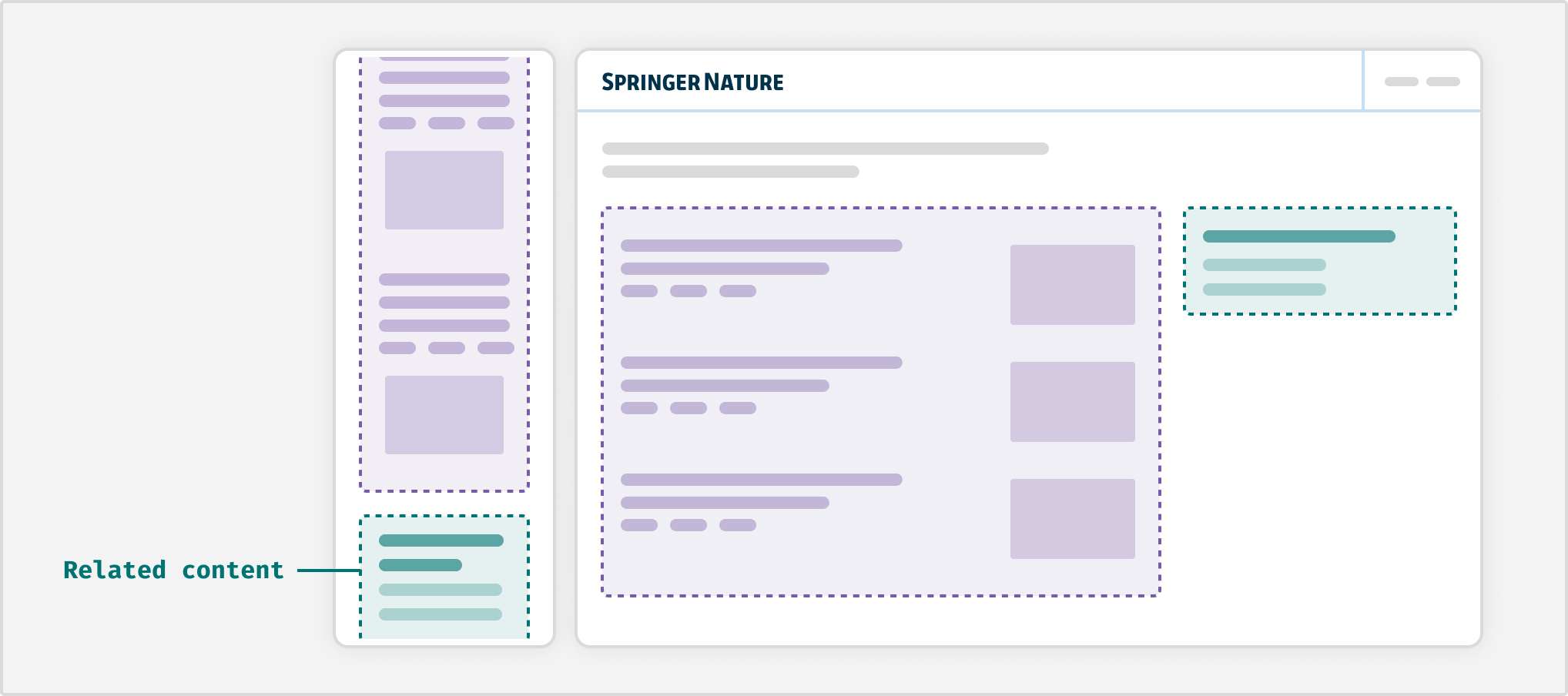
Related content (side bar, right side)
When adding related content such as helpful links, or extra information. Do not use for links that could instead be used within the navigation component.
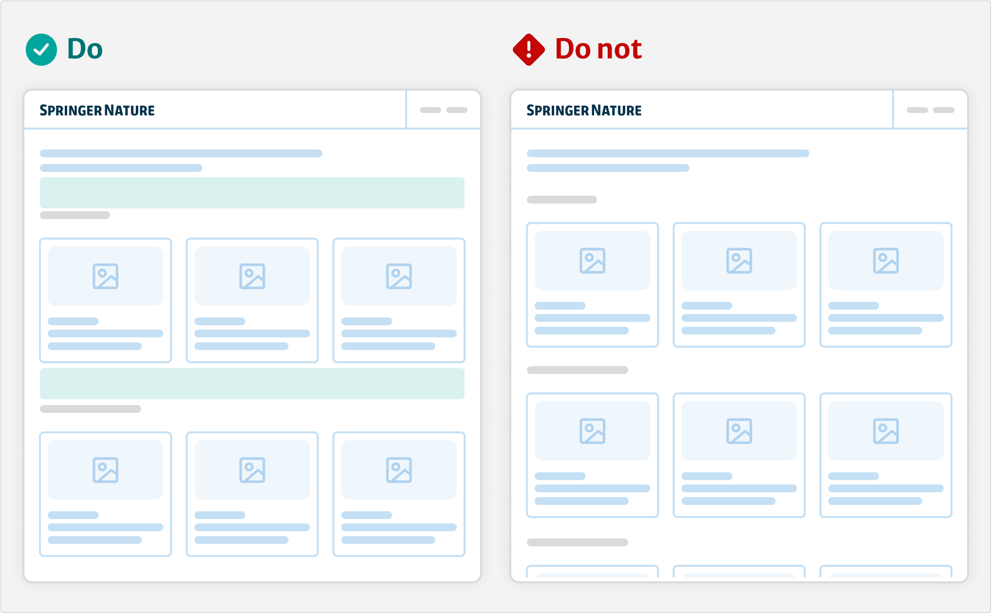
Multi-column grid
Use the grid component to create multiple columns of the same width on wider viewports. On narrow viewports, columns will stack according to the available space.
This is most often used with the card component. Using cards in a grid can be a more engaging way to highlight content or services. This can include landing pages that show a range of options or a section within a page.
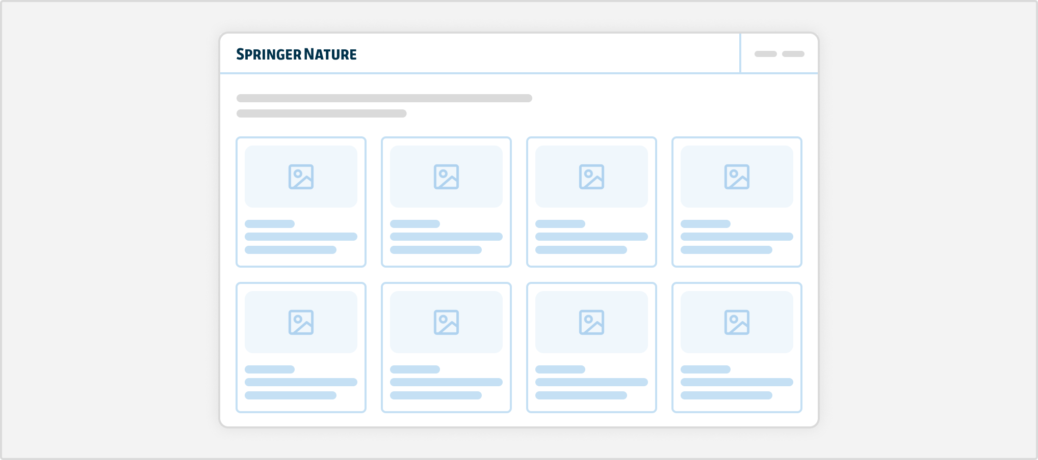
Do not show more than 5 cards per row (within the full width of the content area), as this can make information overwhelming to the user.
Best practices
Use real content
Wherever possible, design with real content and do not rely on placeholders. This will prevent building layouts that break when using real-world content.
Different layout types on the same page
When you have multiple features and complex content, you may want to use different layouts on the same page. For example, one block could be a layout with sidebar, followed by a block with a single column.
However, make sure the placement of elements is consistent and balanced. Think about how the flow of content will help direct the user's attention.
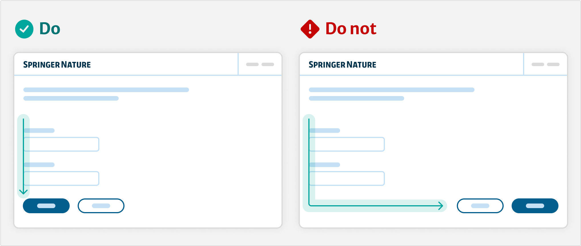
Interaction placement
On forms, make sure that buttons and inputs are left aligned. When there are multiple actions, put the primary button furthest to the left.
Create clear sections
Use the stack component and follow our spacing units to create vertical space between sections of content. Structuring content into visually distinct groups helps users to easily scan content.
Resources
Our layout approach is inspired by Every Layout
Figma templates
Help improve this page
If you have a question, idea, or suggestion to improve this component or guidance, post in the #ask-elements Slack channel or the #ask-elements Teams channel.