Colour
Approach
Colour contrast must be accessible.
Springer Nature is committed to meeting WCAG 2.1 level AA which requires 4.5:1 contrast for text. Use the colours provided to ensure sufficient contrast.
Do not use colour alone to convey meaning.
For example, people who are colour blind will need extra information to know if an element is interactive. Use underlined text, icons and shapes alongside colour to create a more usable interface.
Be consistent.
We use design tokens to define how or when to apply colours within the interface. Using tokens also ensures we think about the semantic meaning of colour usage.
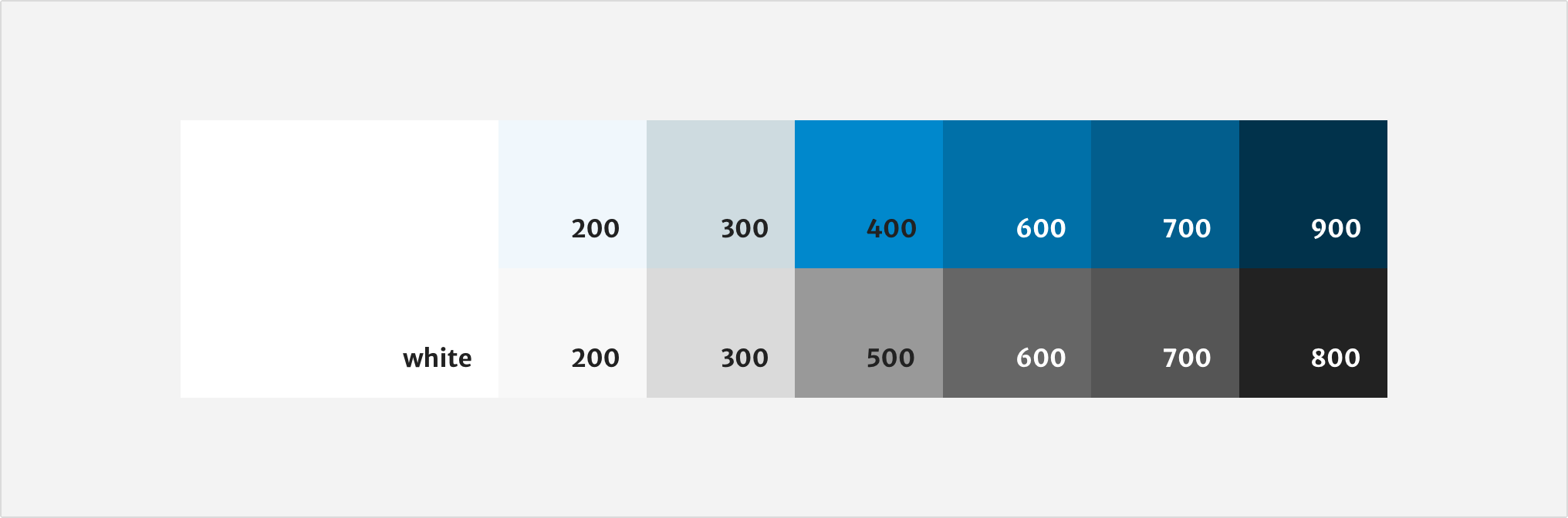
Colour palette
The Springer Nature palette is based on our brand guidelines. Blue-900 is the main brand colour. From this we get a set of blues for different interaction states.
Use the lighter shades to organise and highlight content.
We use greyscale colours for typography, borders and subtle backgrounds. This helps create contrast between sections or elements without dominating the interface.
Applying colour
We use design tokens to define the role of each colour in the interface. Tokens are named based on the type of function they have, as well their placement and interaction state. We use tokens instead of hard coded values to support a consistent user interface across our products.
Only use colours defined by the Elements Design System to ensure consistency across our products. If you’re thinking of contributing a new design that expands the colour palette, contact the elements team on Slack.
Do not adjust the opacity of colours to create tints for interface elements. The only exception is for drop shadows or illustrations.
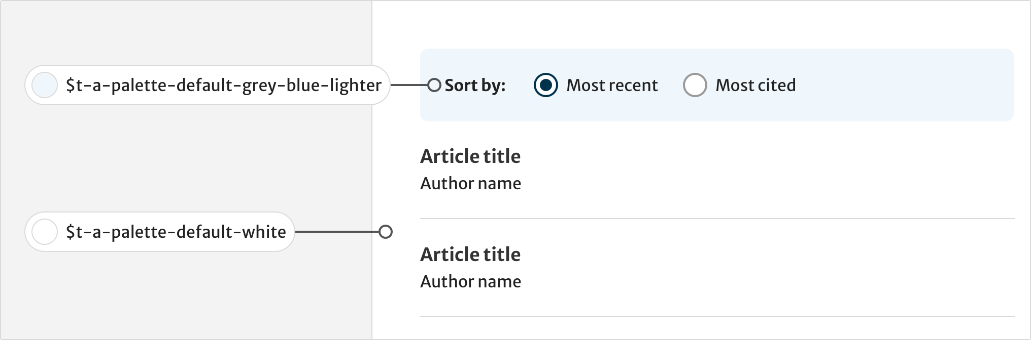
Backgrounds
We use backgrounds for the surface layers of the user interface such as pages, containers, tables, headers, footers and cards. All content such as text, buttons, forms and icons must be on a background.
You can also use backgrounds to visually separate content for the user. However, use this sparingly on a single page to maintain the content hierarchy.
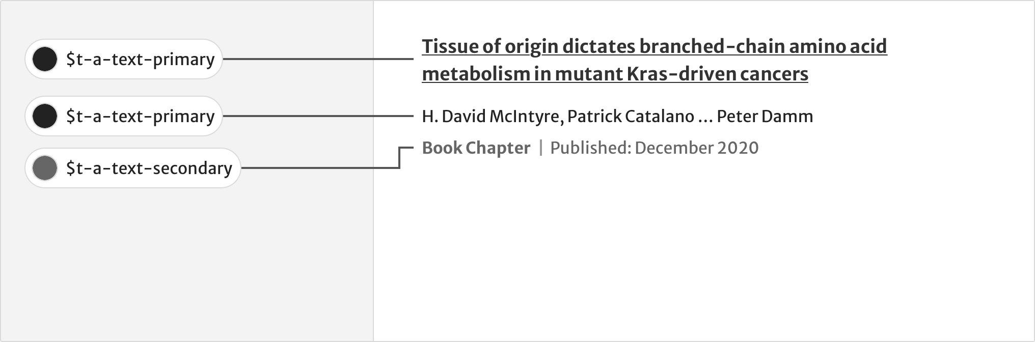
Text
Text colours reinforce our typographic hierarchy. They indicate different states for text links and help wayfinding.
Use primary and secondary text for different levels of importance within metadata. For example, after an article title, author names are the most common way that users assess an article’s relevance.
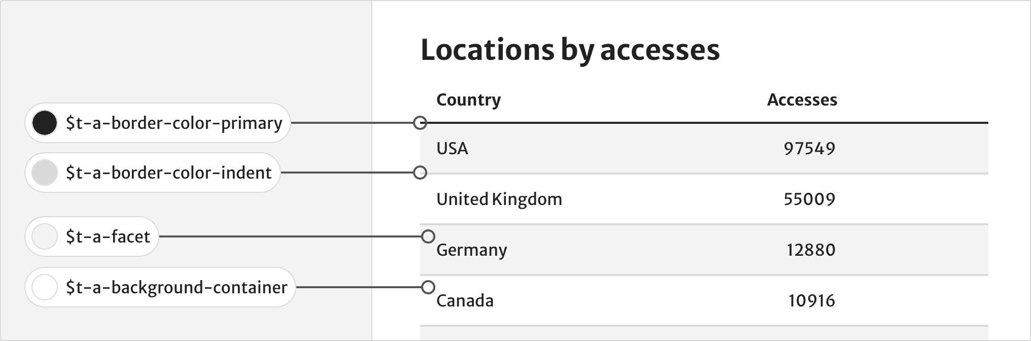
Borders
Borders define the edges of components and help separate sections of content.
Combining backgrounds with borders on table rows makes data easier to scan.
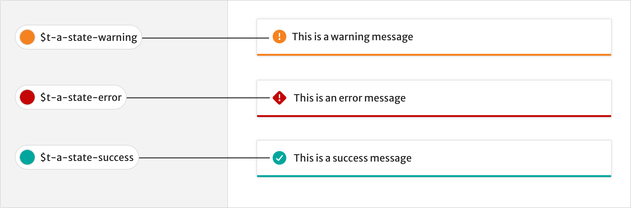
Status
Only use status colours to provide feedback or inform the user of something. For example, use state-information for general information such as showing a user when a product is in early development.
Use state-warning to warn users of upcoming changes, such as changes to a publication.
Use state-success for a success message, such as a successful download.
Use state-error for error validation in forms.
Do not use status colours for text, except status-red for error messages.
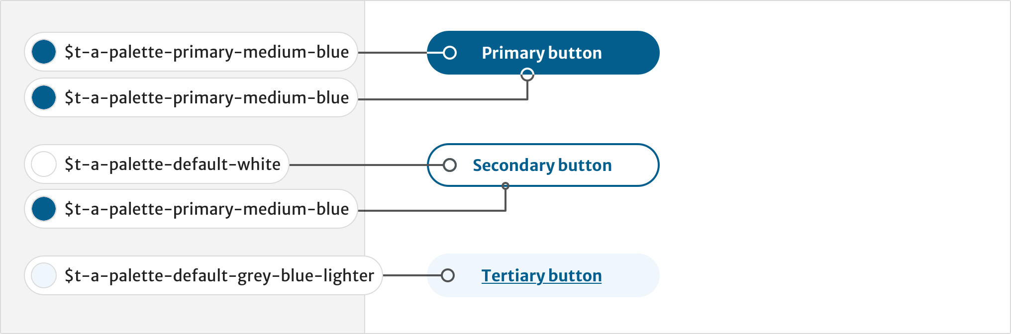
Buttons
Buttons use colours from the core palette to show different states for primary and secondary style buttons.
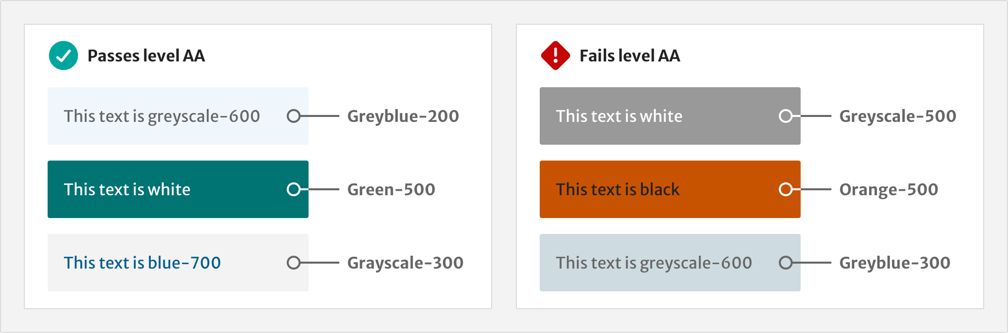
Accessible combinations
People with low vision or colour blindness can find it difficult to read light text on a light background, or dark text on a dark background. Under level AA of the WCAG 2.1, text must have a contrast ratio of at least 4.5:1. Use the table below to see which combinations of colours achieve enough contrast.
Colour pairs spreadsheet (Markdown / HTML table to be included in elements page)
Do not use a colour combination that fails to meet a contrast ratio of at least 4.5:1. Use background colours with the correct colour tokens.
Types of colour vision
This image shows how accent colours may look like to people with different forms of colour blindness compared to full colour vision.
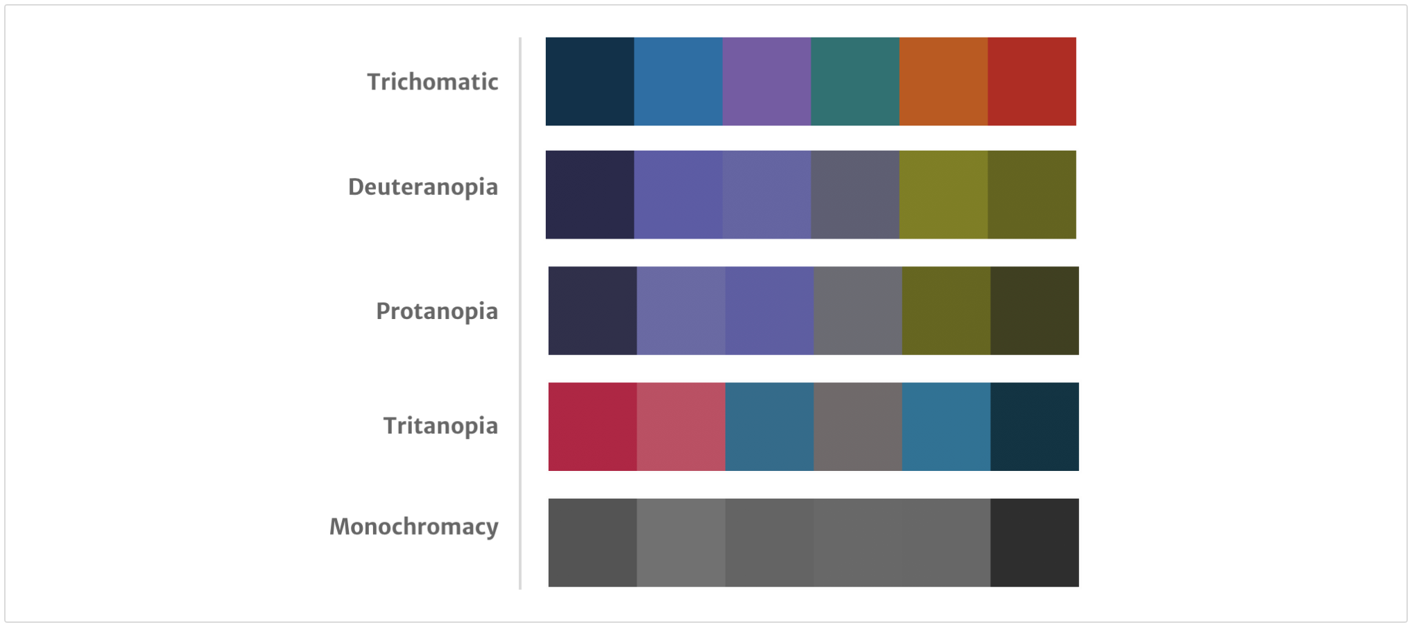
Deuteranopia (may confuse blue and purple) affects about 5% of all males.
Protanopia (may confuse blue and purple) affects about 2.5% of all males.
Tritanopia (cannot distinguish blue or yellow) affects about 0.5% of all males.
Monochromacy
Do not rely on colour as the only visual means of conveying information. Decrease reliance on colour by using icons, text labels and always making sure text links are underlined.
Tools for designers
Use the Sketch styleguide to use the Elements colour palette in your designs.
To check for contrast compliance, use the WebAIM Contrast Checker.
Install simulators such as Color Oracle or Chromatic Vision on your device to simulate what colour blind people may see when they look at a design.
Help improve this page
If you’ve got a question, idea or suggestion about how to improve this component or guidance, post in the #ask-elements Slack channel.