Spacing
Spacing
Approach
Our approach uses gestalt principles, which describe how humans process visual information. By using these principles, we can help users comprehend and interpret the user interface.
For example, when UI elements are positioned closer together, users perceive them to share similar functionality.
We define our measurements as a set of spacing units, with 16px or 1rem as our base unit. Each spacing unit is stored as a design token and can be applied to components on the interface.
Implementation
You can find tokens for each spacing unit inside the literal folder. They are then used by the alias tokens for space.
Layout components
When adding spacing between components:
- use the layout stack component for vertical space
- use the layout cluster component for grouped inline elements
For more information on our approach to layout, go to the layout guide.
Spacing units
Spacing units use a base value of 16px and use multiples of 8 to make it easy to scale across designs and establish consistency. Do not use a spacing value outside of this system.
When designing in sketch, you can move objects by 8px increments by going to Sketch > Settings > Canvas in the top menu.

Applying spacing
Padding
Padding is the internal space between a UI element's boundaries and its content.
If your component has a visible edge, such as a border or background colour, apply padding around the content. This will help make the content more readable.
Do not use padding for space between different components. Use margin instead.
Margins
Margins are the space around an element. For example, the space between the heading of the paragraph and the link.
Gap
Gaps (also known as gutters) are the space between each column or row within a layout.
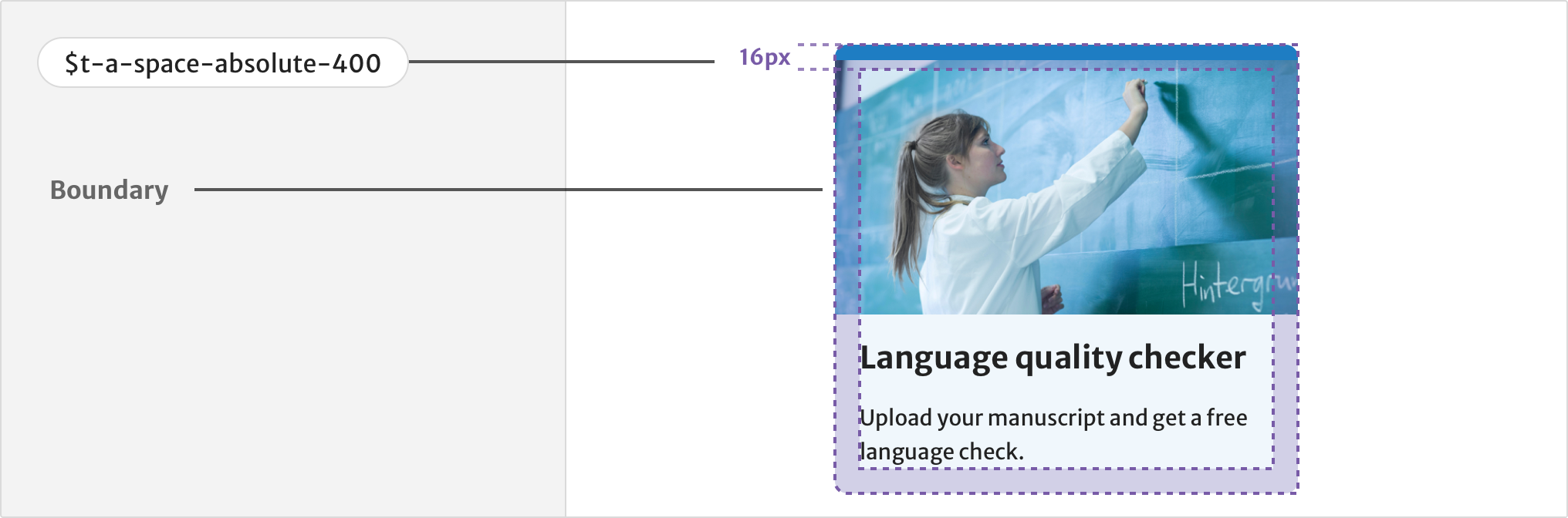
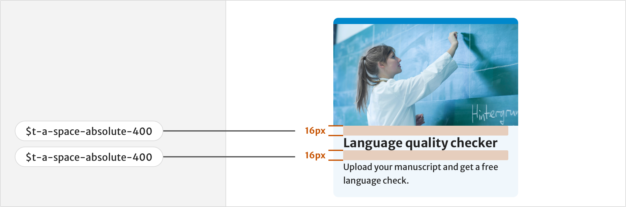
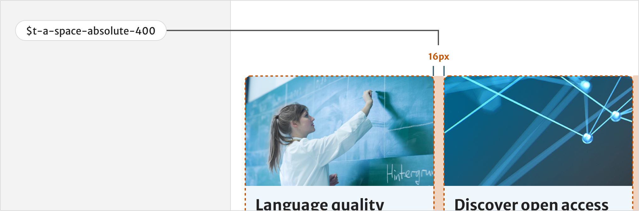
Use a gap of 400 (16px) or more to provide a clear separation between components. This helps make information easier to understand. This is especially important if your component has no visible edge.
Grouping elements
Users will understand elements that are closer together as related and sharing functionality.
For example, group a text label and input field together by using less space, and separate them from other fields by using more space.
Use larger spacing values like 600(24px), 800(32px) and 1200(48px) to separate groups of elements or components from each other.
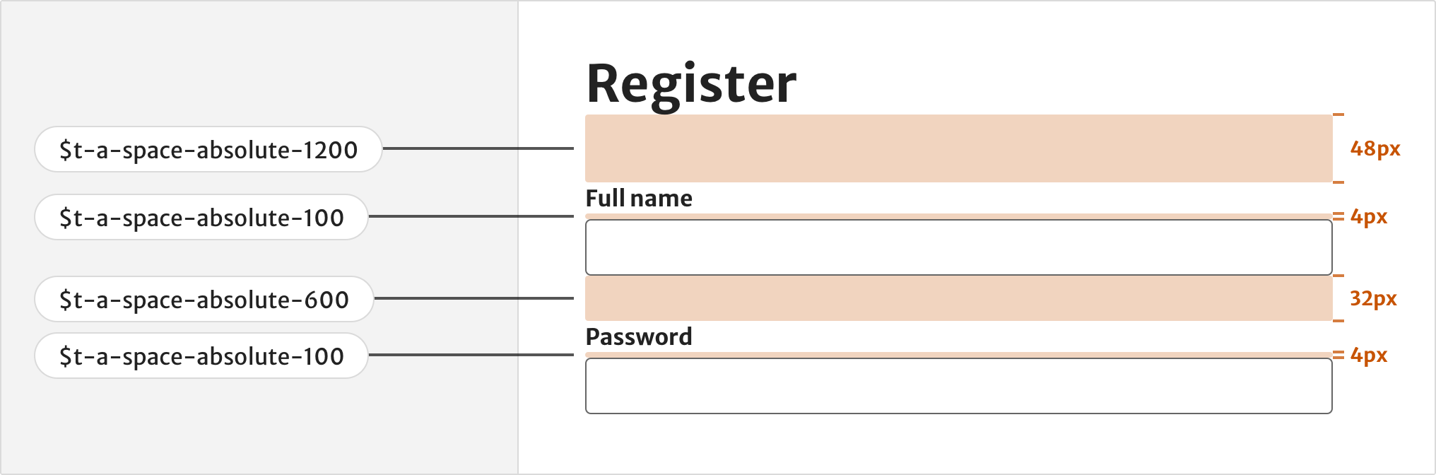
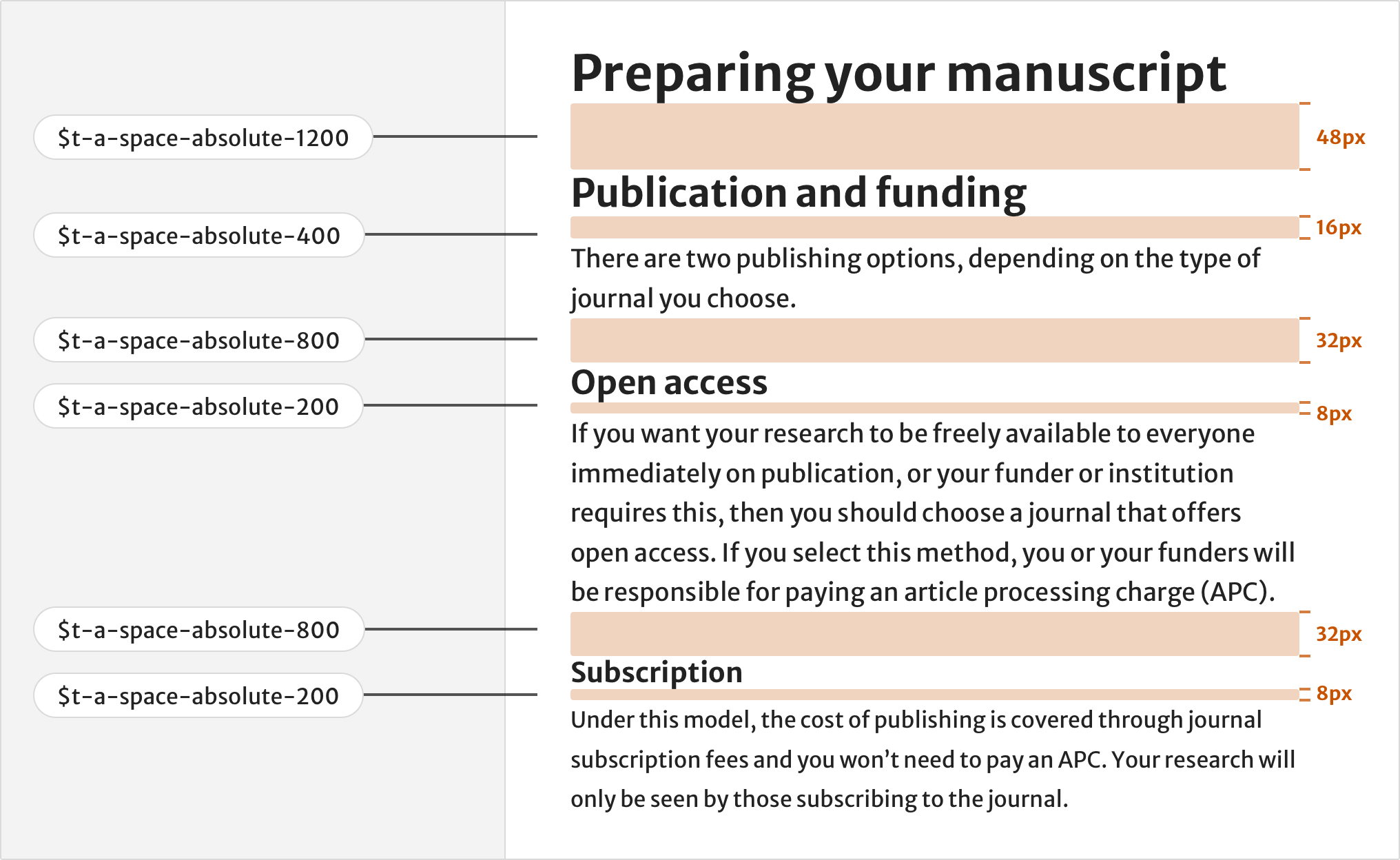
Vertical rhythm
Use spacing on long form content to create a vertical rhythm which helps make the text easier to read.
The contrast in spacing also helps establish a visual hierarchy and makes the content easier to scan. Use the following spacing values help achieve a vertical rhythm:
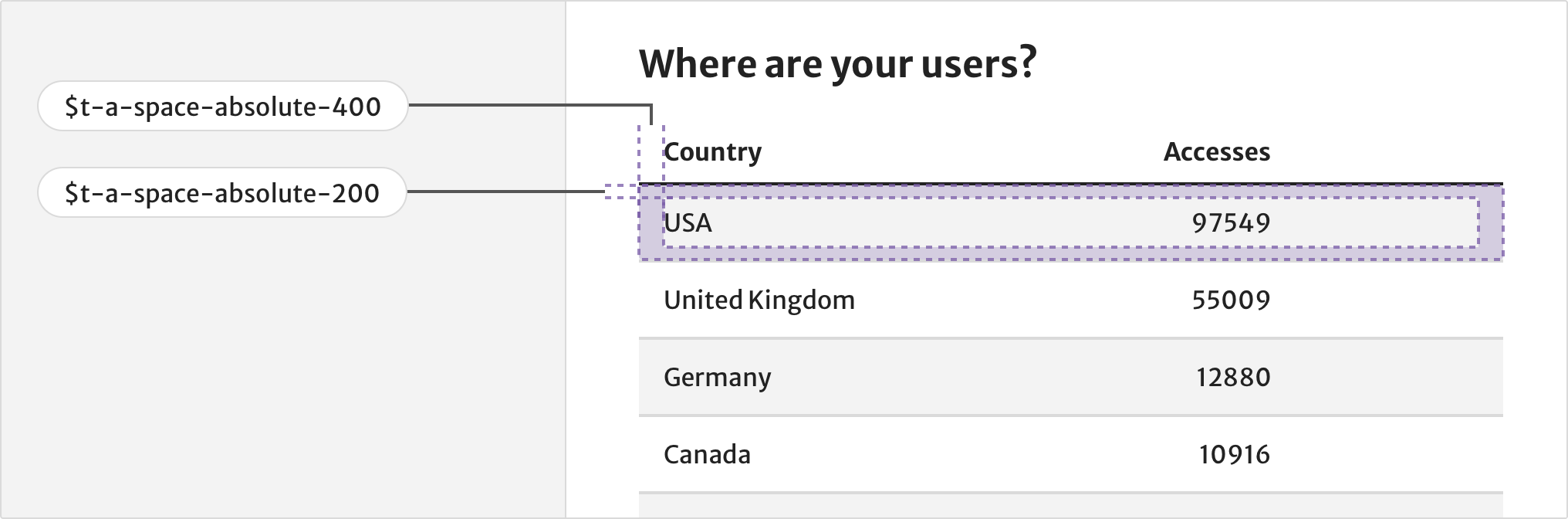
Information density
Information density is the amount of human-readable information within an area of the viewport. A user’s perception of space between information can impact their ability to understand the data or content, as well as the speed they do so.
For components with high information density, such as a table, use smaller units of spacing to help fit more content within a viewport. Make sure the content is still easy to read.
Resources
Help improve this page
If you’ve got a question, idea or suggestion about how to improve this component or guidance, post in the #ask-elements Slack channel.