
Themes and multi-brand support
Elements uses themes to support multiple brands from a single set of components.
We do not build separate components for each brand. Using themes allows us to change the values that a theme applies to the alias and component tokens. The components themselves and the literal tokens stay the same.
This allows brands to keep their visual identity while sharing the same code and page structures.
Literal tokens create a shared foundation, (type scale, spacing scale) with some properties reserved for a specific theme (font family and core colours).
Alias tokens are how we apply themes. We use the same alias tokens (for example, $t-a-border-radius-action) to point to different literal values depending on the theme.
Component tokens inherit the values that the theme's alias tokens resolve to, so components do not need brand specific variants.
For example, the semantic token border-radius-action (used on buttons) resolves to $t-l-sizing-absolute-800 in the Springer Nature theme, but $t-l-sizing-absolute-0 in the Nature theme.
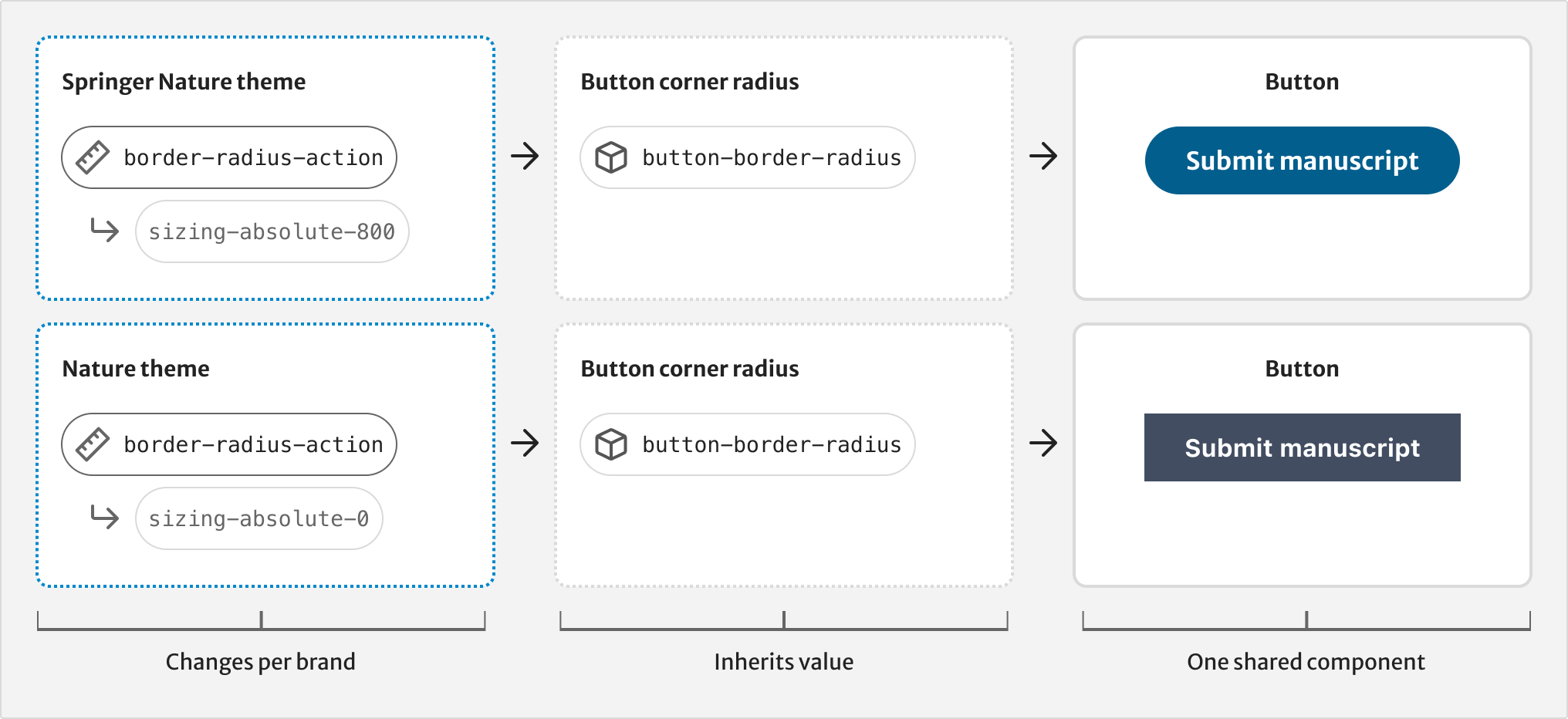
In Figma, themes are represented as variable modes. Designers can switch between themes and see components update automatically.
Help improve this page
If you have a question, idea, or suggestion to improve this component or guidance, post in the Ask Elements Teams channel.