Typography
Approach
Create clear hierarchy.
Our typographic system uses font weight, scale and positioning to reflect the information hierarchy.
Use semantic heading levels to create identifiable sections that are easy to scan.
Design to be legible.
Our fonts, text colours and type spacing helps users to easily read text with minimal effort.
Typefaces
The Springer Nature brand uses the open-source Merriweather family Download the font files from the Elements repository.
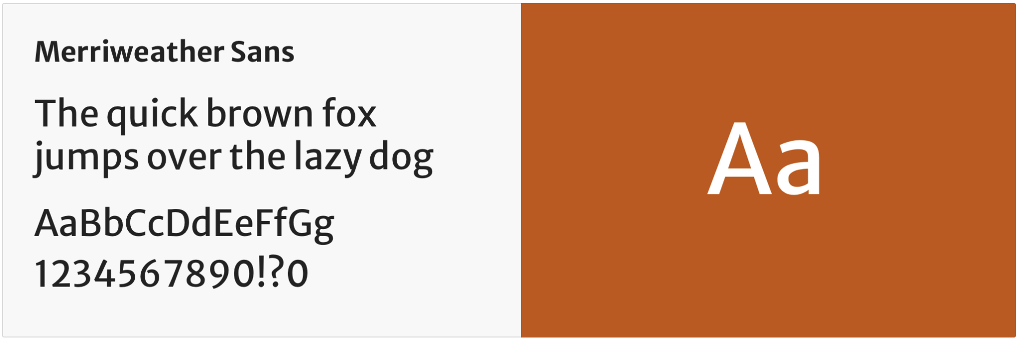
Merriweather sans
Merriweather Sans is the default typeface for Springer Nature. It’s designed to be readable at very small sizes and on low resolution screens.
Use it for headings and main body text, including:
- interactive elements, like buttons, forms and navigation links
- form elements, like text labels, hints and error messages
- instructional text and status messages
- secondary text such as metadata, author names and publication dates
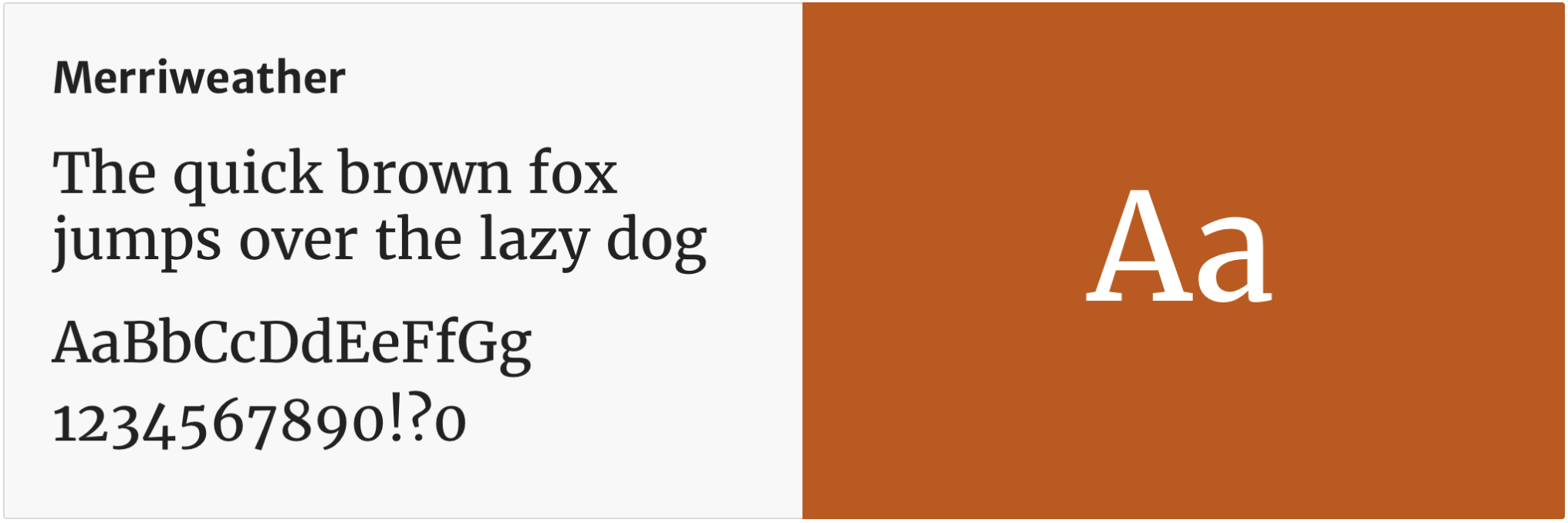
Merriweather
Merriweather is a serif typeface that works harmoniously with Merriweather sans.
Use it for headings and long form content such as articles and book chapters.
Installation
Font files are provided in the Elements repository, in the themes folder. Each brand includes a /fonts folder. Each brand includes a /fonts folder. You will need to create a CSS or Sass file to reference the fonts using @font-face. This should be the first stylesheet you import.
The Merriweather fonts, used by the Springer Nature brand, are variable fonts. The relevant weights, 400 (regular) and 700 (bold), are listed by each font’s font-weight property.
@font-face {
	font-family: 'Merriweather';
	src: url('../fonts/Merriweather-Variable.woff2') format('woff2 supports variations'),
	url('../fonts/Merriweather-Variable.woff2') format('woff2-variations');
	font-weight: 400 700;
	font-display: swap;
}

@font-face {
	font-family: 'Merriweather Sans';
	src: url('../fonts/MerriweatherSans-Variable.woff2') format('woff2 supports variations'),
	url('../fonts/MerriweatherSans-Variable.woff2') format('woff2-variations');
	font-weight: 400 700;
	font-display: swap;
}
The font-display: swap property ensures a system font is displayed until the web font is downloaded. The relevant brand-context stylesheets add suitable fallback fonts in the font-family declaration.
font-family: "Merriweather Sans", "Helvetica Neue", Helvetica, Arial, sans-serif;
Applying typography
Design tokens
We use design tokens instead of hard coded values to support an easily maintainable UI across our products.
For typography, we use literal tokens to define type size, weight, letter spacing and line height.
Alias tokens define our typographic decisions, such as the styles for body text and headings.
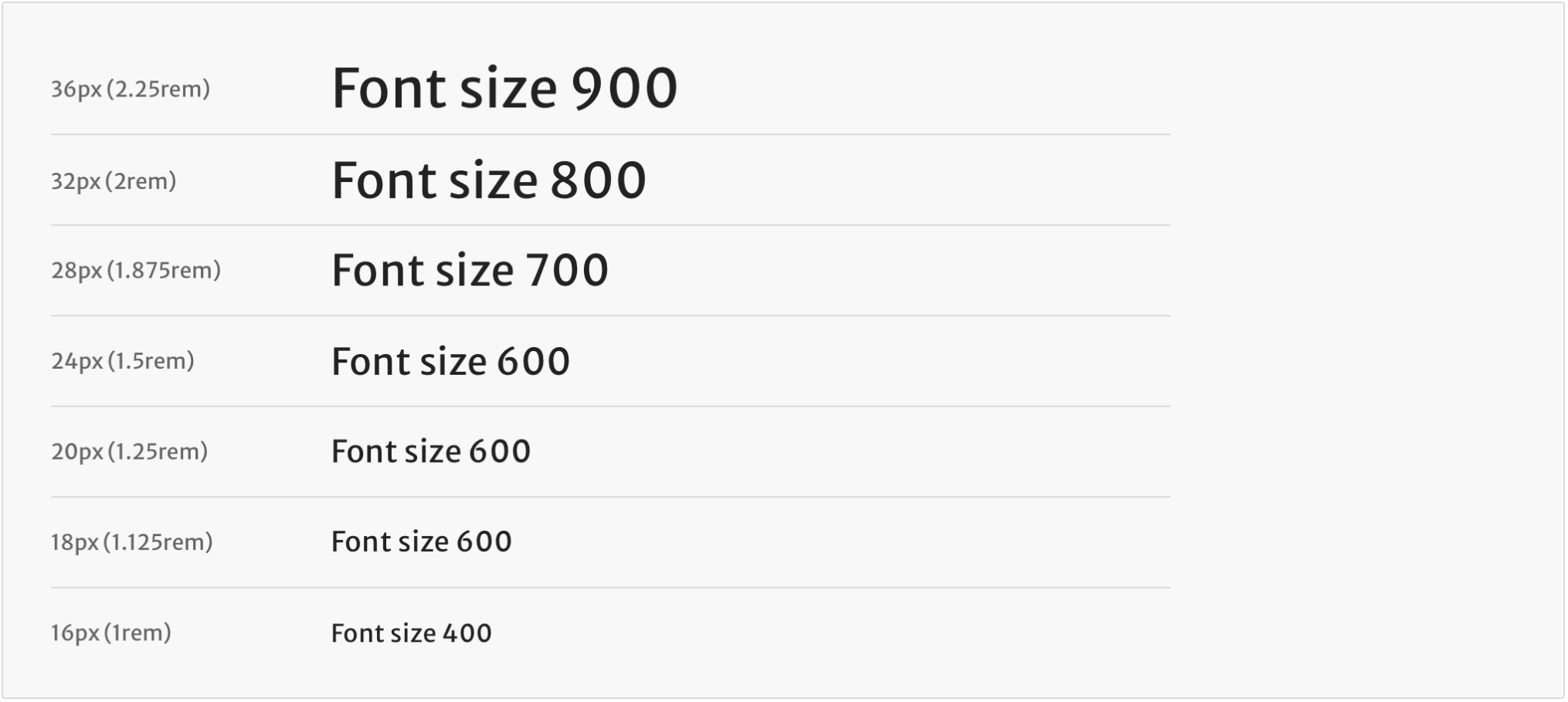
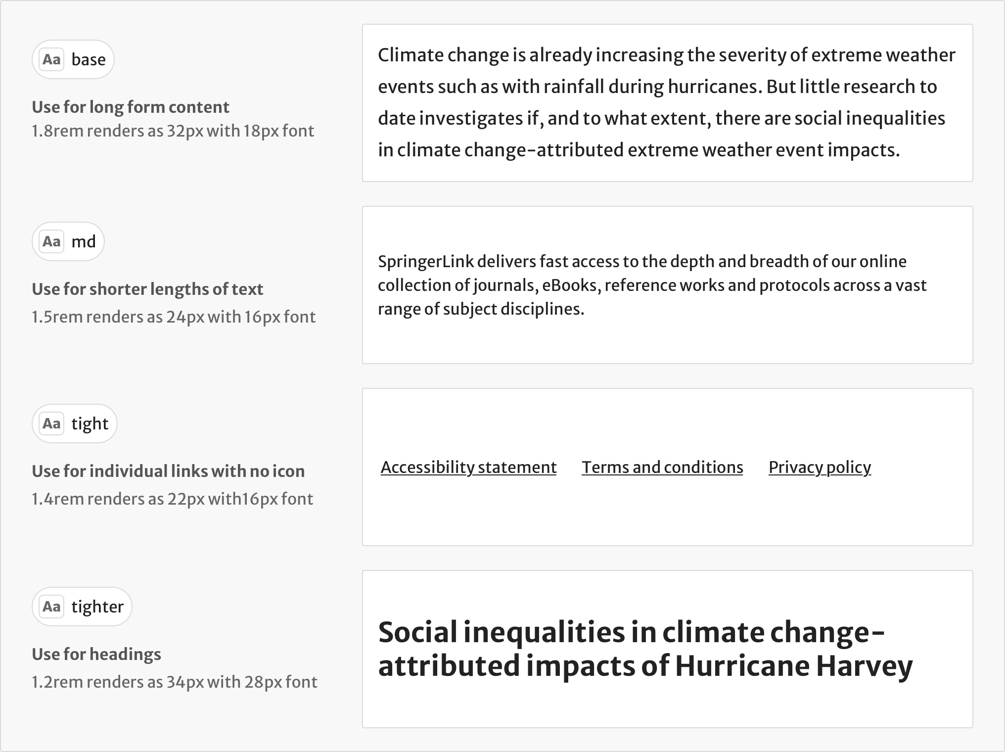
Typographic scale
Our type scale reinforces visual hierarchy. We use tokens to define each type size, using rem units to ensure consistency throughout the UI. The base size is 1rem (16px).
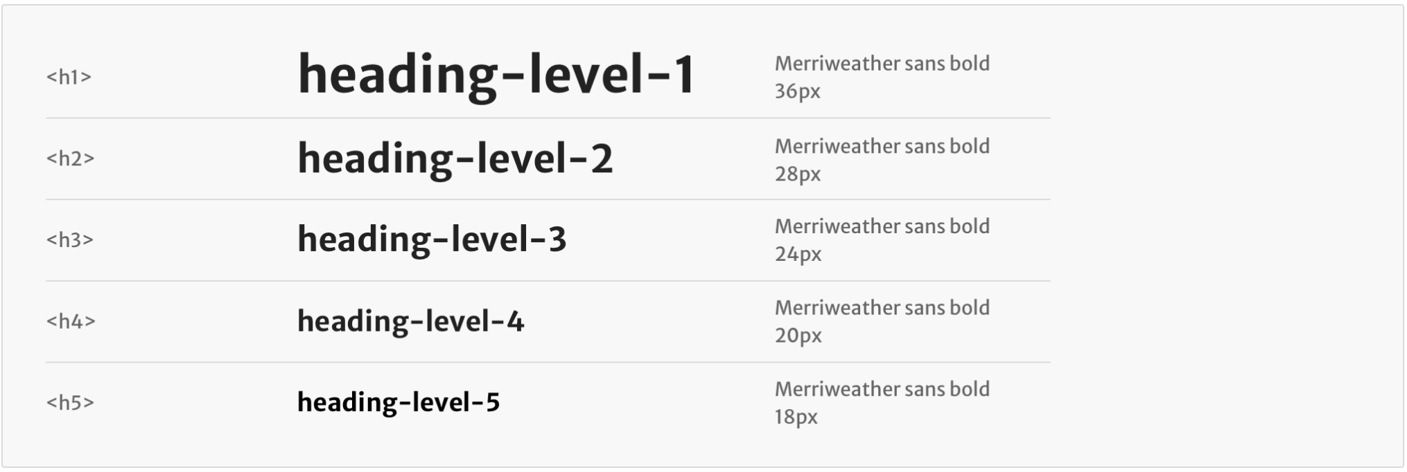
Headings
Use the heading-level token to set the visual size and weight of the heading. This token does not affect the semantic heading level. Always use semantic levels correctly.
We use the alias token fluid to scale headings for small screens. For example, heading-level-1 will use the same style as heading-level-2 on a smaller viewport.
Line length
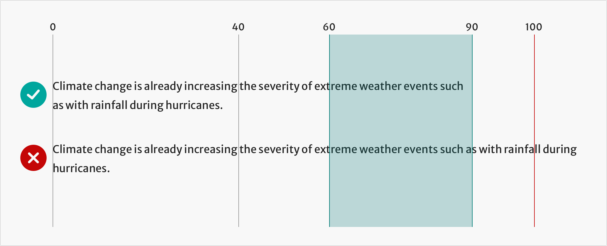
For sentences or paragraphs, do not exceed a line length of 90 characters to maintain a comfortable reading length for users. Text that stretches beyond this limit makes it harder to scan for information and more difficult for the eye to track progress.
Spacing
Line height
We use line-height tokens to set the spacing between lines of text in the same paragraph.
Use line-height that is proportional to the font size. For example, when setting paragraph text that uses font-size-400 (16px), use $line-height-md. Lines that are too close together will negatively impact the readability of your content.
Vertical rhythm
To understand how we apply spacing to headings and paragraphs, go to the spacing guidelines on vertical rhythm.
Tools for designers
To use the Elements typography styles in your designs, use the Sketch style guide.
If you’re designing in Sketch, we recommend that you check the colour contrast of text using the Stark plugin.
Help improve this page
If you’ve got a question, idea or suggestion about how to improve this component or guidance, post in the #ask-elements Slack channel.