Header (new)
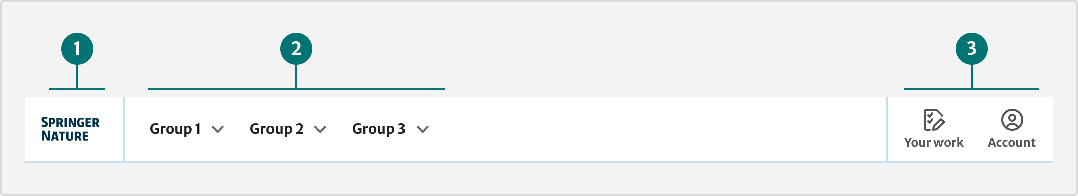
The header helps users navigate across Springer Nature services and find the information they need.
It includes:
-
The logo of the product, which appears on the left. This must link to the domain’s home page.
-
Navigation, the main links that let users get around the website. These appear as a horizontal list but collapse into a menu on smaller screens.
-
Utilities are tools and secondary actions. For example, Springer Nature account or notifications. They appear on the right.
Demo
When to use this component
Use the header for any product, service or website within the Springer Nature brand. The header must be at the top of every page.
How it works
Use the eds-c-header-new component.
We will keep eds-c-header in the package until all teams have started using eds-c-header-new.
Installation
To install the components, go to the get started guide for developers.
To use the Header component (new), enter the following command in your Terminal:
npm install @springernature/elementsThen, import the style of the Header component into your scss file:
@import '../../node_modules/@springernature/elements/components/eds-c-header-new';
@import '../../node_modules/@springernature/elements/components/eds-c-navigation';
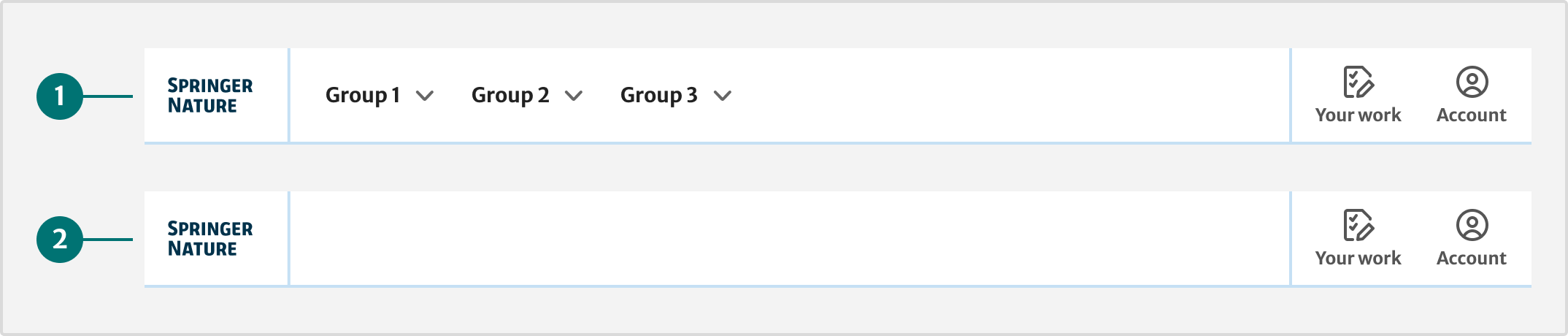
@import '../../node_modules/@springernature/elements/components/eds-c-accordion'; For separate pages, for example error or login pages, you can use the header with only the logo visible. Do not use this for other page types.
To use the default header pass:
logo, headerNavigation object with navigationMain and navigationActionItems, headerNavigationMenu, headerYourWork and headerAccount.
To use the focussed header pass:
logo, headerNavigation object with navigationActionItems, headerYourWork and headerAccount.
To use the header with only the logo pass:
logo object on its own.
For more detailed information on how to use the properties correctly, go to the schema file.
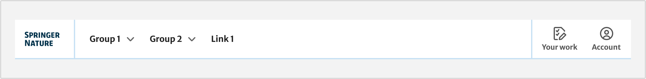
Main navigation
The header uses the navigation component. Use the eds-c-navigation component and set the property trayDropdown: to true.
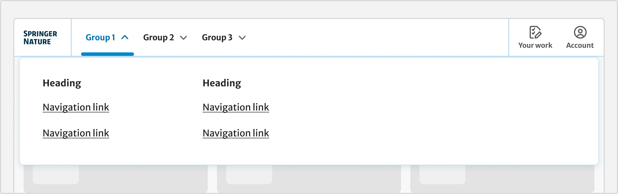
For websites with more sections, use the dropdown menus to organise pages into groups. Do not create more than 4 dropdowns.
Within a dropdown, group links into columns with a heading. Dropdown menus open on select and close when the user selects outside of the menu. For keyboard users, pressing the escape key will close the menu.
On small viewports the navigation component uses the accordion component.
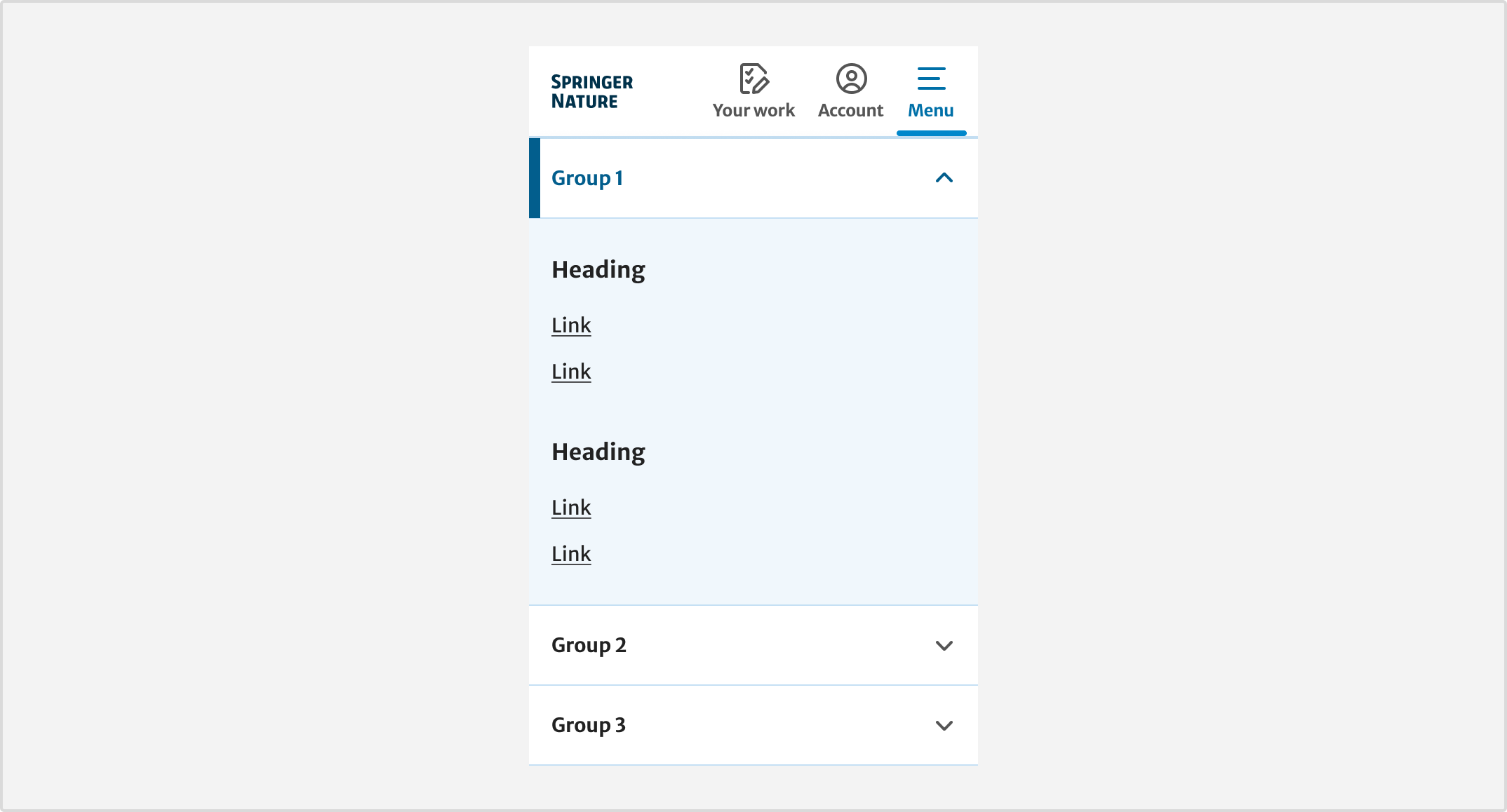
This replaces the navigation with a menu button. When active, navigation will display as an accordion. In this view, groups are represented as sections that can be collapsed and expanded. The first section is open by default.
Use standard links when you have a flat website hierarchy or if a particular link does not fit within a group.
Creating navigation
If you are creating a new main navigation, make sure the:
-
proposed navigation is tested with users
-
labels are clear and unambiguous
-
labels follow our digital writing guidelines
The header on Springer Nature Link uses specific navigation. This set of links is defined by the UX and Product teams and you must not make changes without approval.
Before making a request to change this navigation, read the Springer Nature Navigation governance.
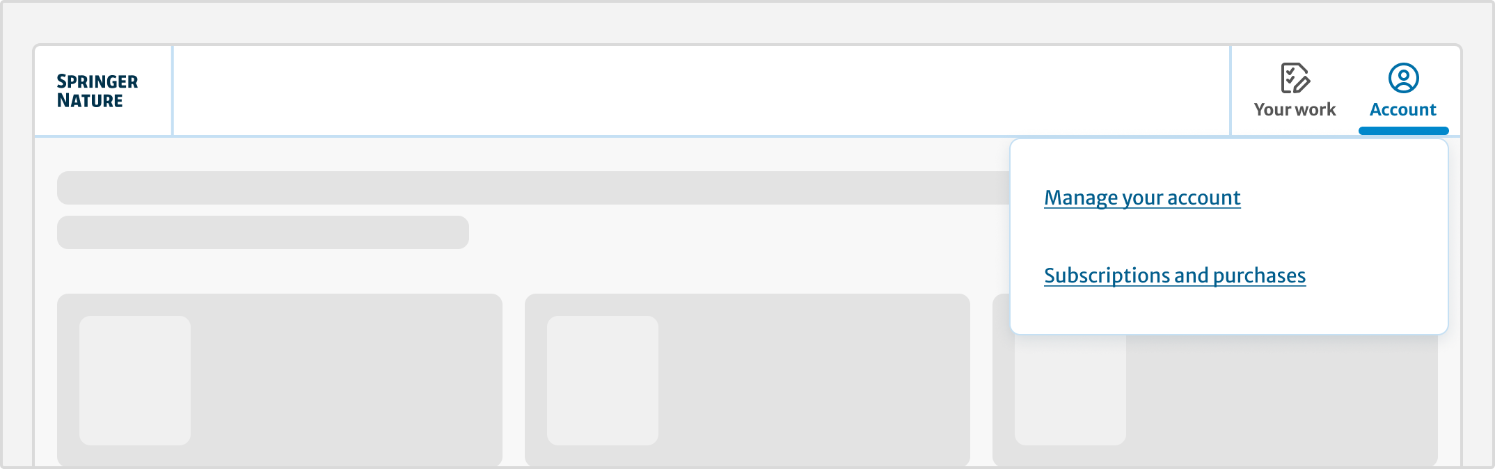
Utilities
Utilities are things users might find it helpful to have access to as they use a product or service.
Some utilities display across multiple products and apply to the whole system. These include:
-
‘Your work’ menu with links to tasks within the researcher journey
-
‘Account’ menu providing access to a user’s Springer Nature profile and account settings
To integrate with the Springer Nature Identity service, use their API. This will give you the data you need for the account menu in the component.
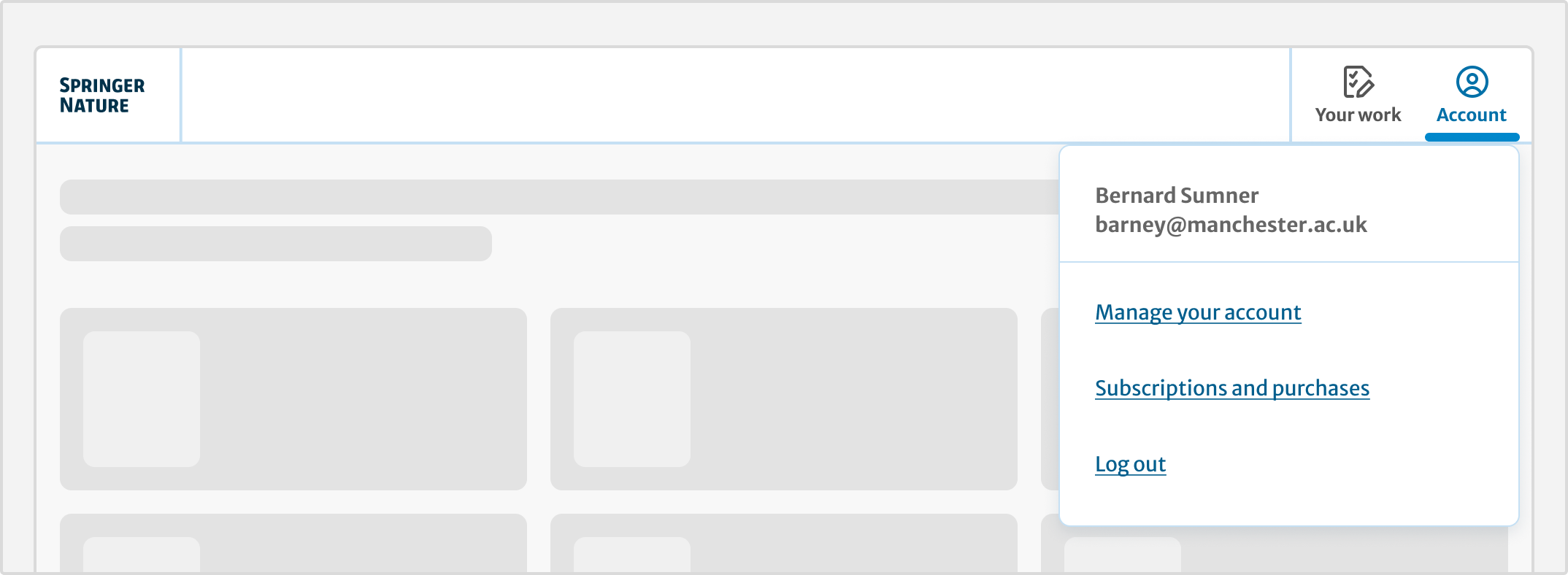
When a user is not logged in, the links in these menus will go to the Springer Nature login flow.
Some utilities are product specific, for example search and the shopping cart. Only include them when they are functional to the product experience.
When the search button is active, a panel will display an input field.
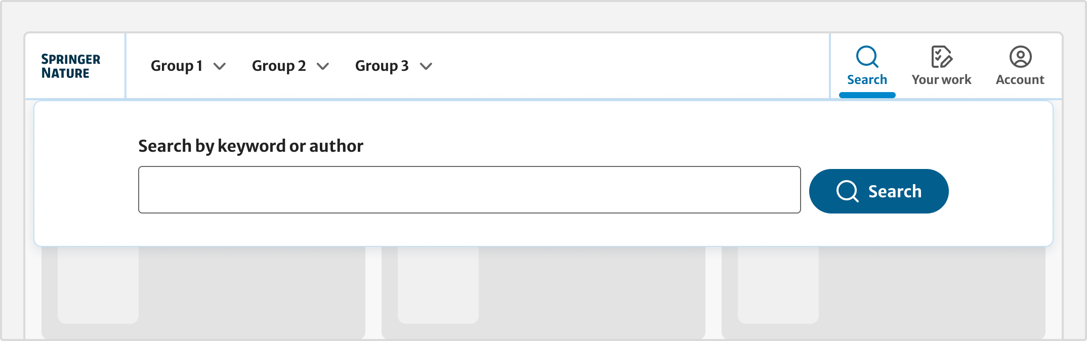
If your product has an advanced search feature, you can include a link to that page using the advancedSearch object.
For more detailed information on how to use the properties correctly, go to the schema file.
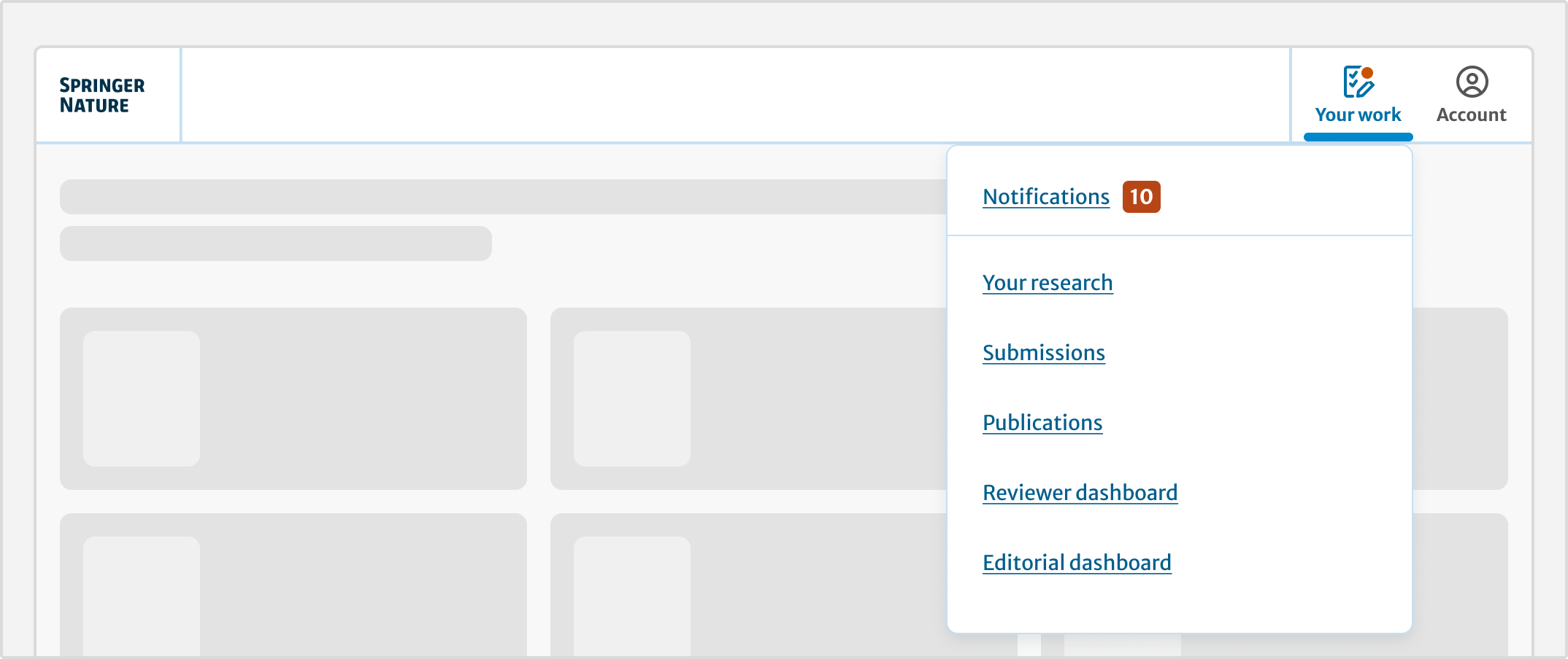
Notifications
The 'Your work’ menu icon shows a badge with the number of unread notifications. When a user opens the menu, a link to the notifications page will display.
Notifications are served by the in-app service. For information on how to design for notifications, go to the content and design rules.
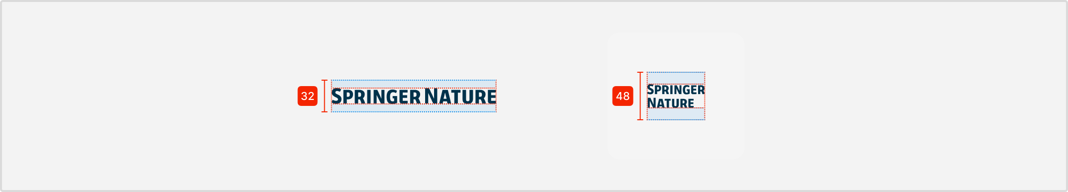
Product logo
Logos are displayed in two formats: vertical and stacked. Stacked versions will show on smaller viewports: for breakpoints xs and sm.
When navigation links are present in the header, the stacked version will also show on md and lg breakpoints.
All logos must follow our brand guidelines and be approved by our brand team. This includes internal services.
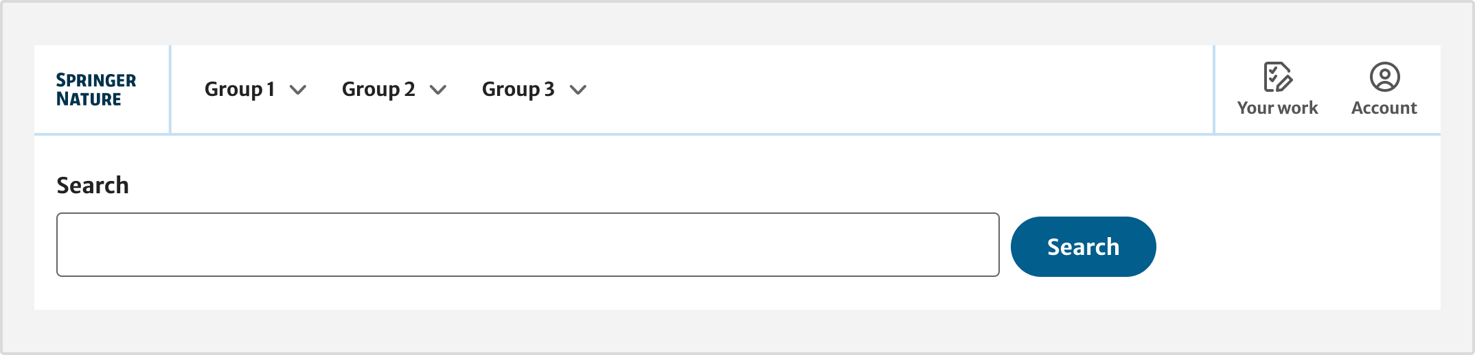
Without JavaScript
The Elements Design System takes a progressive enhancement approach with all components. This means we provide a baseline experience for scenarios when there is no JavaScript. This way, our services will work with basic HTML.
The behaviour of the navigation and utility menus is different with no JavaScript:
-
on larger viewports, dropdown links will anchor to the bottom of the page
-
on smaller viewports, the menu button will anchor to the bottom of the page
-
the search field is open by default and sits underneath the header
-
notifications appear at the bottom of the page
-
the account menu becomes a link to the account landing page
To apply the appropriate labels for assistive technology, use cartCountAriaLabel for cart and notificationsCountAriaLabel for notifications.
JavaScript
Import the javascript files:
import EdsCHeaderNew from '@springernature/elements/components/eds-c-header-new/js/eds-c-header-new';
import EdsCAccordion from '@springernature/elements/components/eds-c-accordion/js/eds-c-accordion';
import navigation from '@springernature/elements/components/eds-c-navigation/js/eds-c-navigation';
If your product has a cart or contains a link to notifications, use the appropriate properties to make that functionality accessible.
On the event of a user adding a new item to the cart, use the cartHandler function passing a count and an ariaLiveMessage as parameters.
Do not forget to update the actual value of the cartCount and cartCountAriaLabel in your application.
Example:
import EdsCHeaderNew from '@springernature/elements/components/eds-c-header-new/js/eds-c-header-new';
const headerNew = new EdsCHeaderNew();

// 1. event: cartCount 0, user adds 1 item. A request is sent to the server to update cartCount and cartCountAriaLabel properties.
// 2. use the header function to handle the event on the user interface

headerNew.cartHandler(1, 'Your cart has 1 item');
This function will:
- update the user interface visually
- handle aria-live regions updates for screen reader users
On the event of a user receiving a notification, use the notificationHandlerfunction passing a count and an ariaLiveMessage as parameters.
Example:
import EdsCHeaderNew from '@springernature/elements/components/eds-c-header-new/js/eds-c-header-new';
const headerNew = new EdsCHeaderNew();

// 1. notificationsCount = 0. Event: the user gets a new notification, notificationsCount is now 1.
// 2. use the header function to handle the event on the user interface.

headerNew.notificationHandler('2', 'you have two notifications');
When an update happens in an ARIA live region, screen readers announce that update once.
After your event happens, make sure to clean up the announcements, using the function cleanAriaLiveAnnouncements.
Template
To support progressive enhancement, the component has a main template and partials templates.
Partials need to be placed in specific areas of your application to achieve the required design in JavaScript and non JavaScript experiences.
At the top of the page place the main header template, the search template and the notification template:
    {{#with data.eds-c-header-new}}
        <div class="eds-c-header__wrapper">
            {{> eds-c-header-new}}
            {{#with headerSearch}}
                <div class="u-js-hide">
                    {{> eds-c-header-new/partials/eds-c-header-new-search-dropdown}}
                </div>
            {{/with}}
            {{#with headerYourWork.notifications}}
                <div class="u-js-hide">
                    <div class="u-container">
                        {{> eds-c-header-new/partials/eds-c-header-new-notifications}}
                    </div>
                </div>
            {{/with}}
        </div>
    {{/with}}
At the bottom of the page place, the navigation expander partial, the account partial, the navigation mobile menu partial and your work partial:
    {{#with data.eds-c-header-new}}
        {{#with headerNavigation.navigationMain}}
            <div class="u-js-hide">
                <div class="u-container">
                    {{> eds-c-navigation/eds-c-navigation-expander}}
                </div>
            </div>
        {{/with}}
        {{#with headerAccount}}
            <div class="u-js-hide">
                <div class="u-container">
                    {{> eds-c-header-new/partials/eds-c-header-new-account}}
                </div>
            </div>
        {{/with}}
        {{#with headerNavigationMenu}}
            <div class="u-js-hide">
                <div class="u-container">
                    {{> eds-c-header-new/partials/eds-c-header-new-navigation-menu}}
                </div>
            </div>
        {{/with}}
        {{#with headerYourWork}}
            <div class="u-js-hide">
                <div class="u-container">
                    {{> eds-c-header-new/partials/eds-c-header-new-your-work}}
                </div>
            </div>
        {{/with}}
    {{/with}}
Javascript
import EdsCHeaderNew from '@springernature/elements/components/eds-c-header-new/js/eds-c-header-new';
import EdsCAccordion from '@springernature/elements/components/eds-c-accordion/js/eds-c-accordion';
import navigation from '@springernature/elements/components/eds-c-navigation/js/eds-c-navigation';
Help improve this page
If you have a question, idea, or suggestion to improve this component or guidance, post in the Ask Elements Teams channel.