Hero
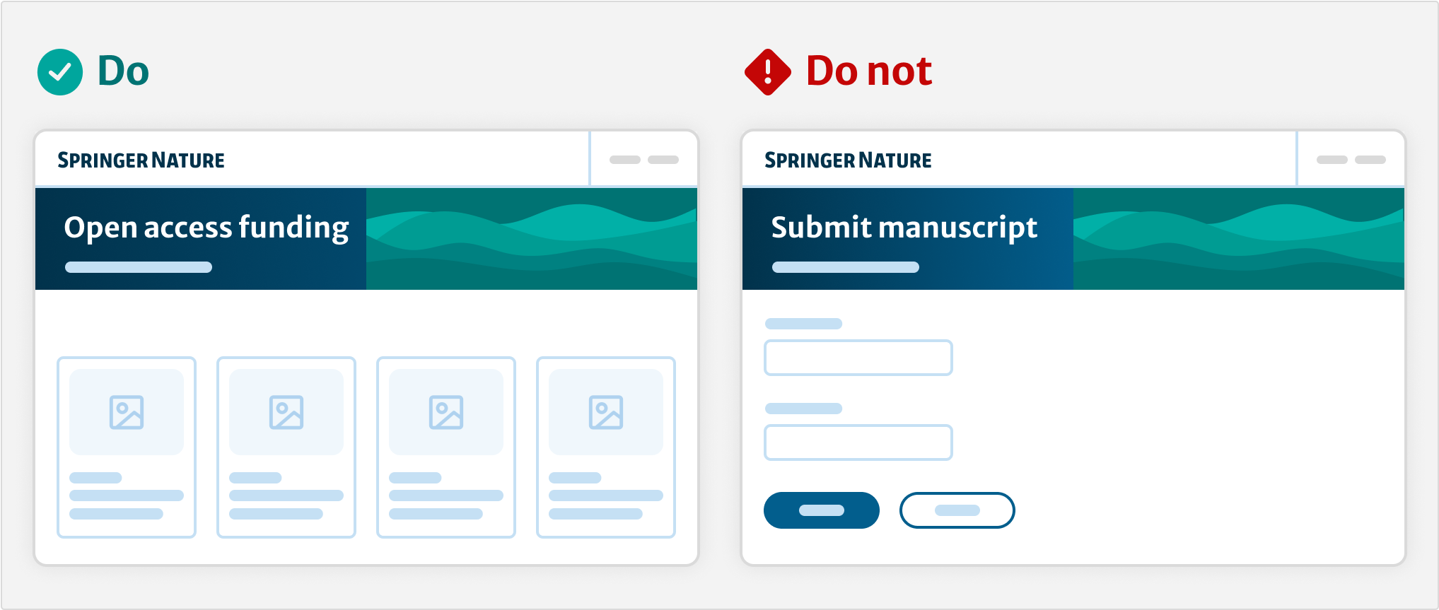
When to use this component
Use the hero component to create an area at the top of the page that introduces the content and places it in context. For example, when you need to include important metadata and useful links alongside the heading.
When not to use this component
Do not use the hero component for:
Pages with a single clear purpose, for example forms, log in, error or confirmation pages. For these, use a heading on its own.
Task based applications, for example dashboards, administration pages. For these, if needed you can use the basic variant of the hero with only the heading in it. This will provide the white text on colour background.
How it works
Installation
To install the components, go to the get started guide for developers.
To use the Hero component, enter the following command in your Terminal:
npm install @springernature/elementsStyles
Import the styles of the Composable Hero component into your scss file:
@import '../path/to/@springernature/elements/components/eds-c-hero';Variants
We provide templates for 4 variants.
Basic
| Name | Description | Required |
|---|---|---|
| bgColor | A string that contains the class name of the colour palette. | ✅ |
| bgPicture | The hero background has an image. A gradient will show on top of the image. | |
| breadcrumbs | Adds breadcrumbs to the component. | |
| title | The title of the Journal, the Article or the Topic | ✅ |
| subtitle | Optional subtitle or introduction text. | |
| metrics | Adds metrics to the component. | |
| buttons | Adds a button to the component. |
To view all the properties of this component, go to the schema.
Article
| Name | Description | Required |
|---|---|---|
| bgColor | A string that contains the class name of the colour palette. | ✅ |
| bgPicture | The hero background has an image. A gradient will show on top of the image. | |
| breadcrumbs | Adds breadcrumbs to the component. | |
| title | The title of the article or book. | ✅ |
| subtitle | Optional subtitle or introduction text. | |
| metrics | The metrics | |
| access | Access infos | |
| cover | Journal or Journal of the article or book cover | |
| buttons | CTA |
To view all the properties of this component, go to the schema.
Journal
| Name | Description | Required |
|---|---|---|
| bgColor | Is a string that contains the class name of the colour palette | ✅ |
| bgPicture | The hero background has an image. A gradient will show on top of the image | |
| breadcrumbs | Adds breadcrumbs in the component | |
| title | The title of the Journal, the Article or the Topic | ✅ |
| subtitle | The subtitle of the component | |
| metrics | The metrics | |
| partnership | Imprints and societies section | |
| access | Adds access type label. | |
| cover | Adds cover image for the journal. | |
| buttons | Adds a button to the component. |
To view all the properties of this component, go to the schema.
Search
| Name | Description | Required |
|---|---|---|
| bgColor | A string that contains the class name of the colour palette. | ✅ |
| bgPicture | The hero background has an image. A gradient will show on top of the image. | |
| breadcrumbs | Adds breadcrumbs to the component. | |
| title | The title of the page. | ✅ |
| subtitle | Optional subtitle or introduction text. | |
| metrics | Adds metrics to the component. | |
| buttons | Adds a button to the component. | |
| heroSearch | Adds a search input to the component. |
To view all the properties of this component, go to the schema.
Search (Autocomplete)
| Name | Description | Required |
|---|---|---|
heroSearch |
Adds a search block to the hero. Use searchAutocomplete instead of searchInput to render the Autocomplete component. |
✅ |
searchAutocomplete |
Object matching the eds-c-autocomplete template (contains input and optional dataAttributes). |
✅ |
searchBtn |
Button configuration for submitting the form. | ✅ |
To view all the properties of this component, go to the schema.
An example application of the Hero Component can be seen on the Elements Sandbox.
Best practices
Visual weight
On a homepage or sub page, the hero can establish a strong visual hierarchy. For example, a supporting image and subtitle. However, if the page is focused on one task, like a form, this adds unnecessary visual weight. On these pages, avoid using the hero or use the most basic version .
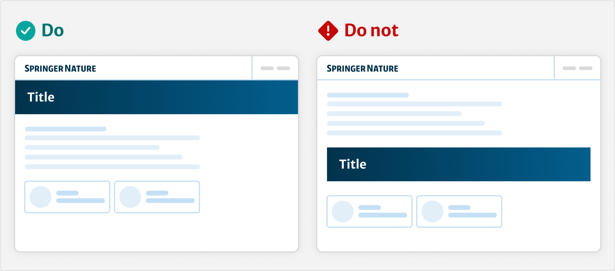
Hero placement
Place the hero below the header and before the main container on the page. Do not place the header within the main container as this disrupts the heirachy.
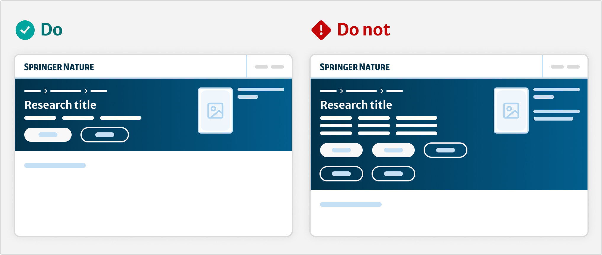
Cognitive load
Use the hero to guide users toward a primary action on research content. Do not overload the hero with multiple actions and links. Use a maximum of one primary and one secondary button.
Configuration
How to compose
Use eds-c-hero as a wrapper.
Use the subcomponents as needed.
For example:
{{#with components.eds-c-hero}} // your data for the hero component
	{{> yourpartials/eds-c-hero-basic}}
{{/with}}
or
{{#with components.eds-c-journal}} // your data for the hero component
	{{> yourpartials/eds-c-hero-journal}}
{{/with}}
or
{{#with components.eds-c-hero-search}} // your data for the hero component
	{{> yourpartials/eds-c-hero-search}}
{{/with}}
If you need to further customise the hero with your own subcomponents, you can do so.
The eds-c-hero template has a @partial-block. Use this as a wrapper for your custom template.
When you create your custom template, check the hero component partials folder.
You can reuse some common UI parts like eds-c-hero-title.hbs, eds-c-hero-subtitle.hbs, or eds-c-hero-cover.hbs.
bgColor
To apply background colour, find the CSS class that you need in the theme file or theme pastel file.
If the colour is a pastel colour, the string must contain eds-c-hero--pastel and then the class for the specific colour.
For example:
"bgColor": "eds-c-hero--pastel eds-c-hero__colour-10--pastel",picture
Use <picture> for the hero background, the journal and book covers, or for the logos of imprints and societies.
imageMimeType
Safari browser version 13 does not render webp images correctly even where there is a fallback image as jpeg.
Use the imageMimeType property to add the image type. This will add imageMimeType: image/webpage” and fix this issue.
If image type is not included, it will try to load the webp image format even though it is not supported.
citations
To correctly display the citations button, add the CSS class eds-c-hero__button--citations in the eds-c-button uiSettings.
	"uiSettings": {
		"cssClass": "eds-c-hero__button--citations"
	}
Help improve this page
If you have a question, idea, or suggestion to improve this component or guidance, post in the Ask Elements Teams channel.