
Dropdown navigation
The dropdown navigation component groups related links into a collapsible menu.
Demo
When to use this component
Use the dropdown navigation component to group links when they:
- fit into an overall category
- only benefit some users
- are considered lower priority content, especially on smaller viewports
When not to use this component
Do not use the dropdown navigation component when its links:
- do not relate to an overall category
- need to be visible to all users at the same time
- are critical links that must be visible by default
How it works
Installation
To install the components, go to the get started guide for developers.
To use the dropdown navigation component, enter the following command in your Terminal:
npm install @springernature/elementsStyles
Import the styles of the dropdown navigation component into your scss file:
@import '../path/to/@springernature/elements/components/eds-c-dropdown-navigation';Without JavaScript
The Elements Design System takes a progressive enhancement approach with all components. This means we provide a baseline experience for scenarios when there is no JavaScript. This way, our services will work with basic HTML.
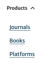
Without JavaScript, the entire dropdown navigation with its header and items are visible. The header serves as plain text label for the dropdown navigation
items which are displayed with a left indent below the label.
Options
Root options
| Name | Description | Required |
|---|---|---|
| id | Unique identifier for the dropdown navigation instance. | ✅ |
| dropdownHeader | Object holding configuration for the dropdown toggle. Go to the header options. | ✅ |
| items | Array of items for the dropdown navigation menu. Go to the item options. | ✅ |
| dataAttributes | Array of custom data attributes to add to the dropdown navigation button. |
Header options
| Name | Description | Required |
|---|---|---|
| label | The text displayed in the dropdown navigation header. | ✅ |
| iconURL | URL of the SVG icon used for expand/collapse indicator. | ✅ |
| jsHook | Overrides the default dropdown's collecting hook (data-eds-c-dropdown-navigation-header).This can help to set up dropdowns with custom configuration. |
Item options
| Name | Description | Required |
|---|---|---|
| linkText | Text for the link. | ✅ |
| linkUrl | URL for the link. | ✅ |
| dataAttributes | Array of custom data attributes to add to the link. | |
| ariaCurrent | aria-current attribute value for the link.It supports: page, step and true. |
JavaScript
To enable dropdown navigation components on a page, the simplest way is to use the following snippet:
const edsDropdownNavigation = new EdsCDropdownNavigation();
edsDropdownNavigation.init();
This component uses the Expander helper.
The EdsCDropdownNavigation constructor takes a configuration object described here.
| Name | Description | Type |
|---|---|---|
| jsHook | Overrides default dropdown navigation's collecting hook (data-eds-c-dropdown-navigation-header).This can help to set up dropdown navigations with custom configuration. |
String |
| expanderOptions | Overrides default Expander helper options. Helpful if you need to customise the expand and collapse behaviour. |
object |
A more advanced way to enable the dropdown navigation component on a page would be:
const edsDropdownNavigationWithAutofocus = new EdsCDropdownNavigation({
 jsHook: 'data-eds-c-dropdown-navigation-header--autofocus',
 expanderOptions: {
  AUTOFOCUS: 'firstTabbable'
 }
});
edsDropdownNavigationWithAutofocus.init();
The targeted dropdown navigation component is created using the jsHook option from Header options. The JavaScript enhances this dropdown navigation and enables it to autofocus on its first focusable link upon expansion.
Configuration
To view the configurations for this component, go to the schema.
Help improve this page
If you have a question, idea, or suggestion to improve this component or guidance, post in the Ask Elements Teams channel.