Card
Cards highlight and promote content or services at relevant points in the user journey.
Demo
When to use this component
Use the card to highlight and link to further content or services at points where it might be helpful to your users.
When not to use this component
Use cards carefully. Too many cards can be overwhelming and mean that nothing is highlighted.
How it works
Installation
To install the components, go to the get started guide for developers.
To use the Card component, enter the following command in your Terminal:
npm install @springernature/elementsStyles
Import the styles of the Card component into your scss file:
@import '../path/to/@springernature/elements/components/eds-c-card';Variants
The card variants are:
- with image
- with icon
- with metadata
- no image
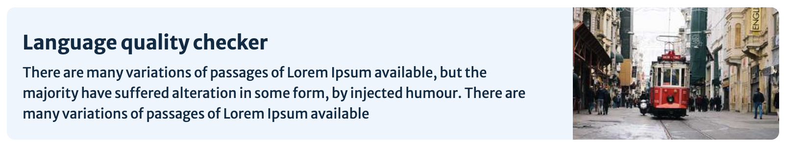
withImage
To use the card with an image, set the withImage property to true.
If you want to provide different images for the different resolutions, you can pass your data using the picture HTML tag.
withIcon
To use the card with an icon instead of an image, set the withIcon property to true.
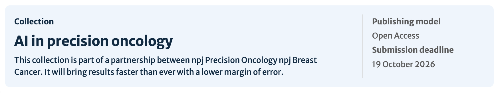
withMetadata
To display metadata such as dates or content types alongside a title and description, set the withMetadata property to true and enter the items in the metadata array. You can only have 2 unique metadata items in this array.
To use the metadata card with a white background, set thebackgroundColorWhite property to true.
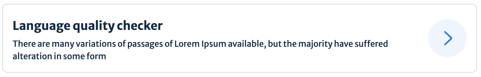
noImage
To use a card with only title and summary, set the noImage property to true. Do not pass image or iconURL in the data.
Configuration
To view all the properties of this component, go to the schema.
layoutVariant
This is a required property that controls whether a card layout should always be vertical or should change to a horizontal layout at the from-tablet breakpoint of 768 pixels.
The property expects one of the following string values:
"enum":["eds-c-card--horizontal-responsive", "eds-c-card--vertical-default"]If you want the card to change from vertical to horizontal based on a media query, change the layoutVariant from eds-c-card--vertical-default to the CSS selector of your choice.
Then use the component scss mixin eds-c-card--horizontal inside that selector.
Import the mixin for the responsive styles:
// consumer application level code
@import '../path/to/@springernature/elements/components/eds-c-card'; // default styles
@import '../path/to/@springernature/elements/components/eds-c-card/scss/variants/eds-c-card--horizontal'; // and responsive mixin for horizontal card
Include the mixin for the horizontal card inside your application scss:
// consumer application level code

// name of the scss selector
.eds-c-card--horizontal-responsive {
    // custom media query coming from consumer needs
    @include from-desktop {
        @include eds-c-card--horizontal;
    }
  }
Write the name of your scss selector in the layoutVariant property. In this example it is eds-c-card--horizontal-responsive.
You can change the string value of layoutVariant, but it must match the name of the scss selector that you decide to write in your application.
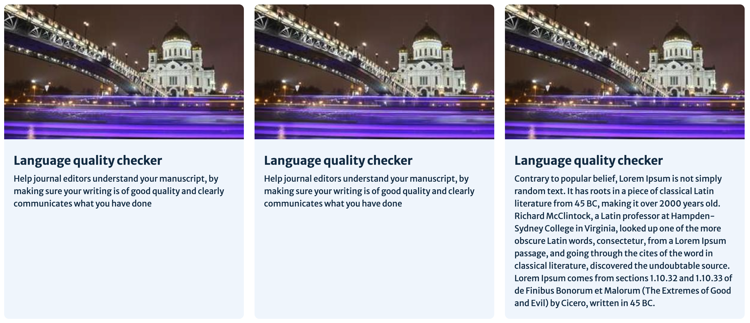
cardStretchHeight
This is an optional property. If set to true, it will make your card the same height as the tallest card in the row.
highlight
This is an optional property. If set to true, it will add a blue line to the card.
You can use this option to help a card stand out on a page. Or, if you have a long list of cards, you could add the line to each one as a way of marking out the list items.
On smaller screen sizes, the blue line will always be at the top of the card. If you are using the horizontal layout, then on larger screen sizes it will be on the left side of the card.
srOnlyHighlightText
This is an optional property that allows you to add a descriptive label about the use of the highlight for screen reader users. Use it to explain why a card is highlighted and give more meaning to screen reader users.
image.aspectRatio or picture.aspectRatio
The aspect ratio for the image area is 16:9 and you should try to keep this aspect ratio for images. Where necessary, you can change this by using the aspectRatio property on the card’s image data.
"aspectRatio": "4 / 3"truncateSummary
This is an optional property. If set to true, it will limit the summary text to 3 lines and then add an ellipsis.
You should keep summary text to under 150 characters and set this limit in your application. Where longer text is unavoidable, use this property.

cardLabel
This is an optional property. If set to true it will allow you to add a label above the title.
This label should be used to indicate content types, for example ‘Article’ or ‘Review’. Work with a content and/or UX designer to choose the correct labels.
titleSmall
This is an optional property. If set to true, the text size of the title will reduce in size to 1.25 rem.
Help improve this page
| If you’ve got a question, idea or suggestion about how to improve this component or guidance, post in the #ask-elements Slack channel. |