Status message
Status message lets you add different types of message banners to a page. These can either be always on the page or appear based on certain conditions or events.
When to use this component
Use a status message when you need to tell the user something that is additional to the main content of the page.
For example, use a:
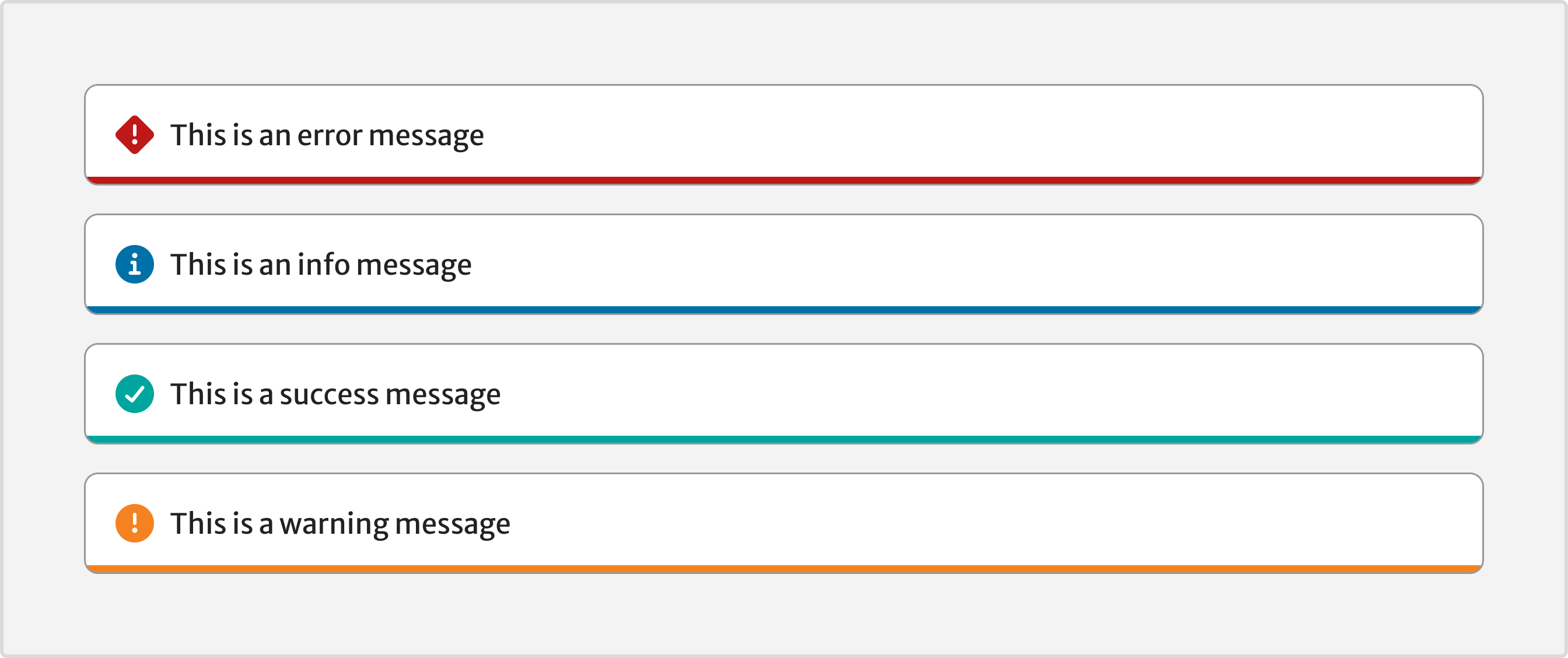
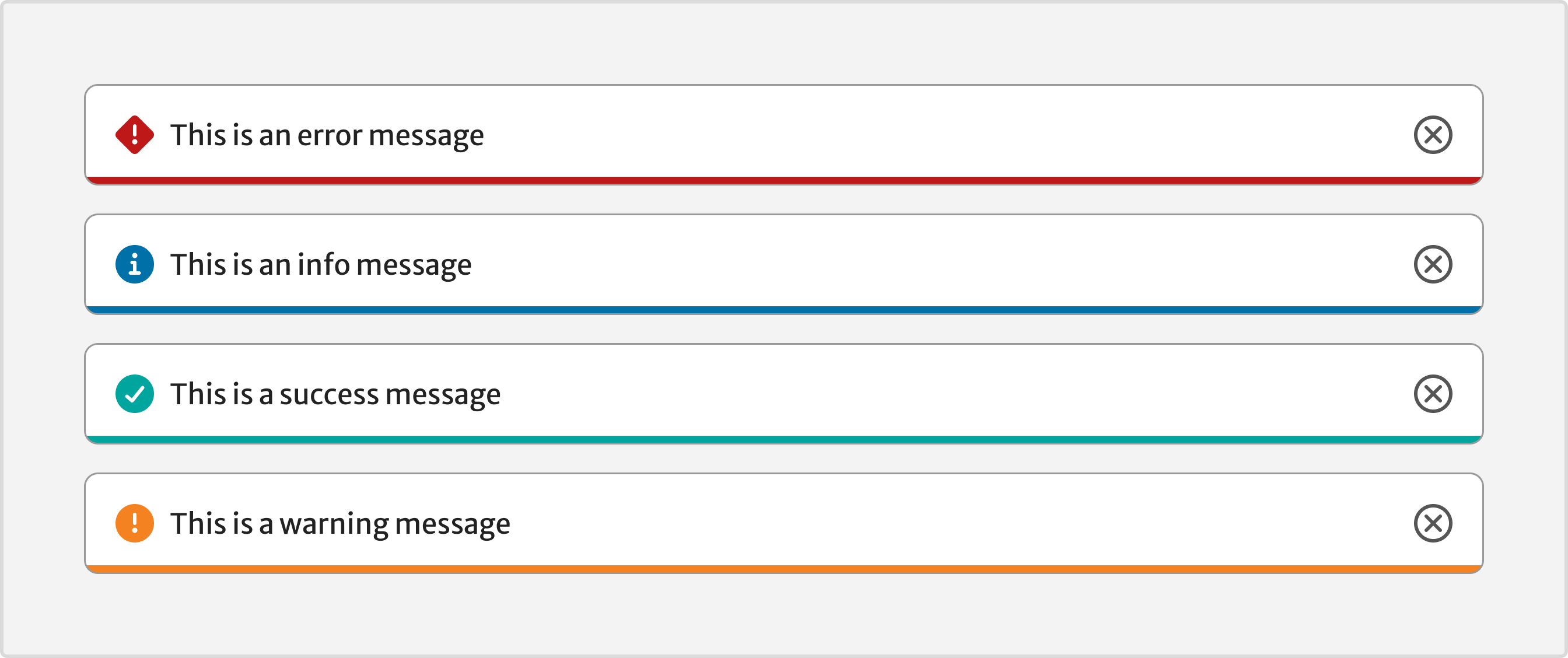
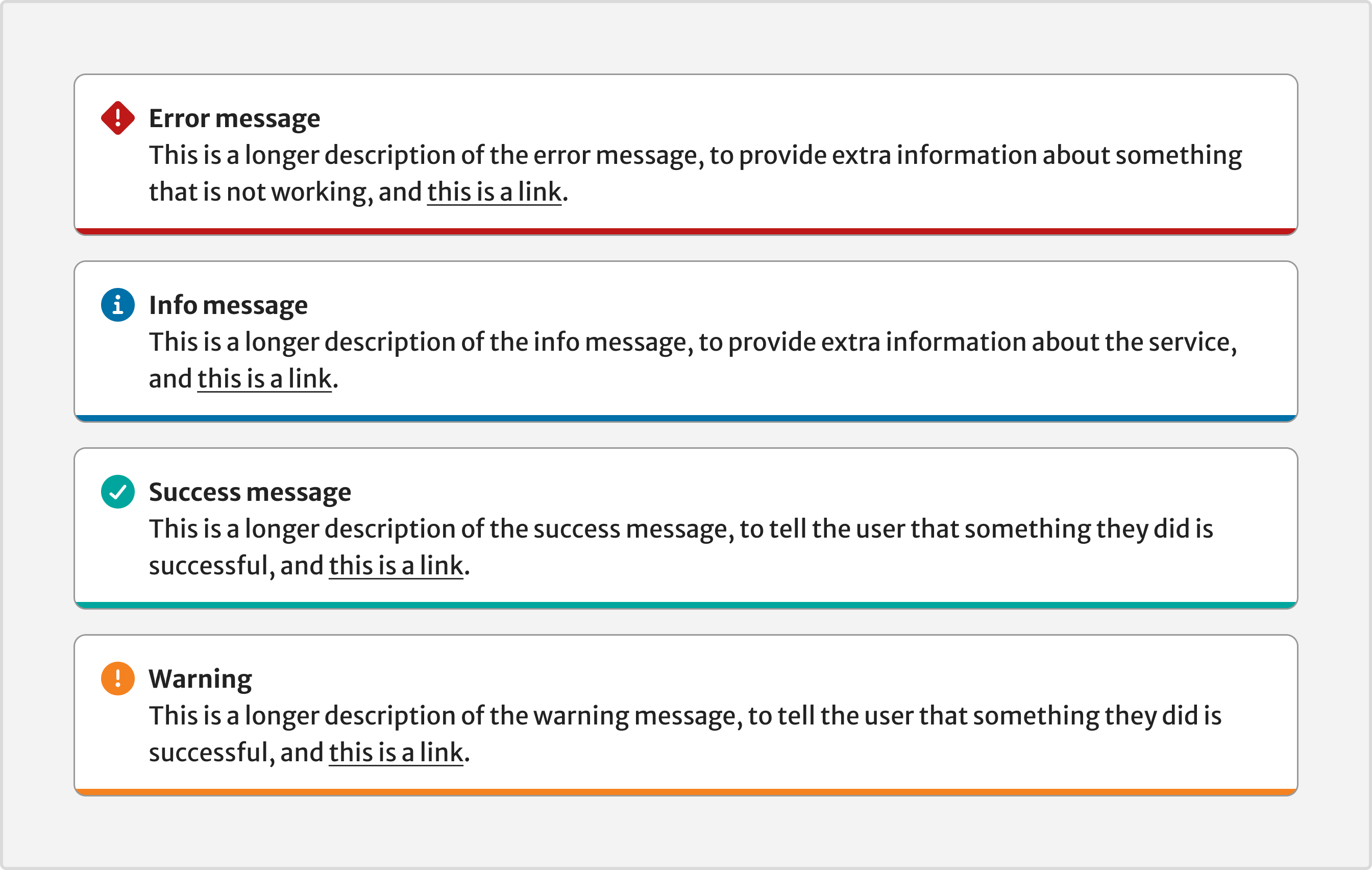
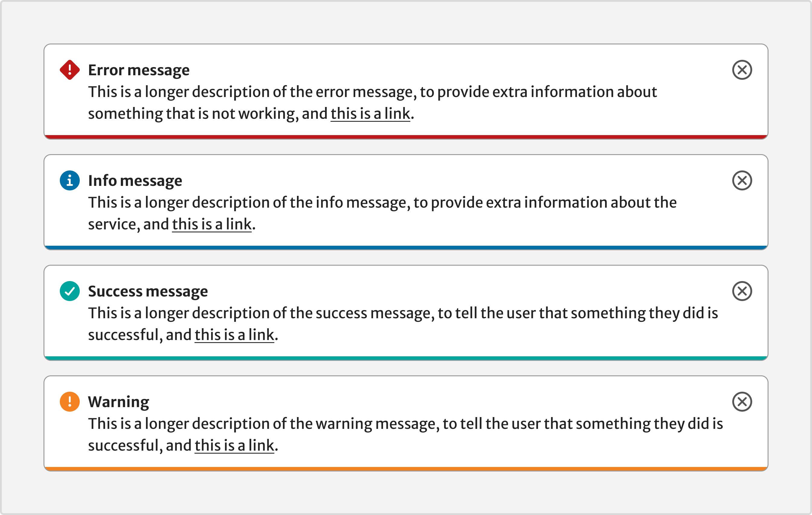
- success status message to tell the user that something they did has been successful
- warning status message to tell the user something they need to know about the content or service
- info status message to give the user extra information about the content they are looking at
- error status message to tell the user that something is not working
When not to use this component
Do not use an error status message for form validation. Instead, use the validation and error summary from the form component.
How it works
Use status messages sparingly. People often miss them and using them frequently will likely make this worse.
Installation
To install the components, go to the get started guide for developers.
To use the Status message component, enter the following command in your Terminal:
npm install @springernature/elementsStyles
Import the styles of the Status message component into your scss file:
@import '../path/to/@springernature/elements/components/eds-c-status-message';Message types
Set the style of the message type by adding one of these modifiers.
Warning
"type": "warning"Success
"type": "success"Info
"type": "info"Error
"type": "error"Live region
If your status message appears or changes based on JavaScript events, then you need to use ARIA live region. This means that screen readers will announce the message when it appears or changes.
"liveRegion": "true"Status added
Add the live region to the page before the icon and message inside it.
<!-- first add the wrapper -->
<div class="eds-c-status-message" role="status" aria-live="polite">
</div>
Status changed
If you change the message after the page has loaded, a screen reader would announce the new message.
Focus
Supply an id in the data to make the status message focusable programmatically.
Focusing the message ensures it is visible in the viewport and a screen reader will announce it. If it is not appropriate to move focus to the message, rely on the live region for announcement in screen readers.
Variants
The status message variants are:
- Without label (Permanent, Dismissable)
- With label (Permanent, Dismissable)
Without label
To use the status message with a dismissable icon, set the dismissable property to true.
With label
To use the status message with a label, set the withTitle property to true.
To use the status message with a dismissable icon, set the dismissable property to true.
Demo
Help improve this page
| If you’ve got a question, idea or suggestion about how to improve this component or guidance, post in the #ask-elements Slack channel. |